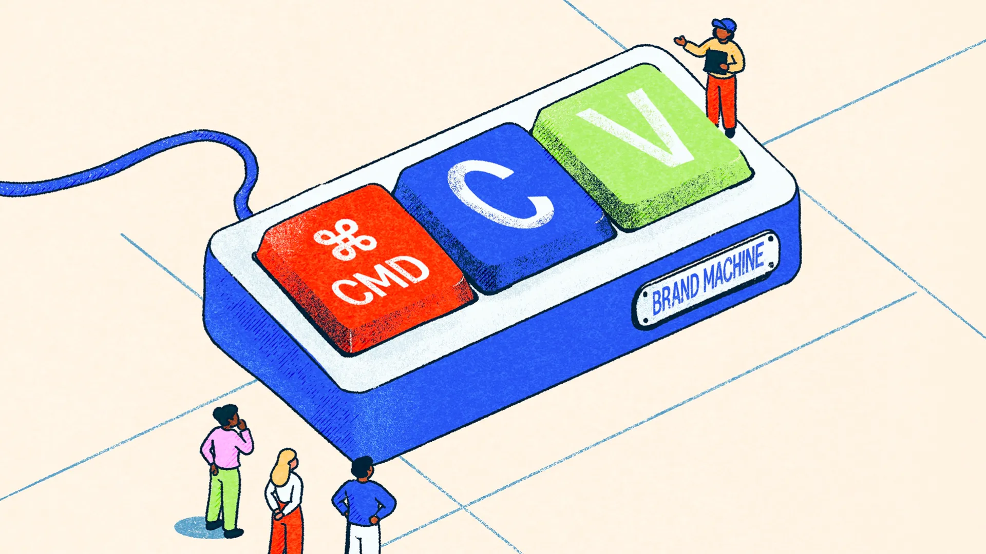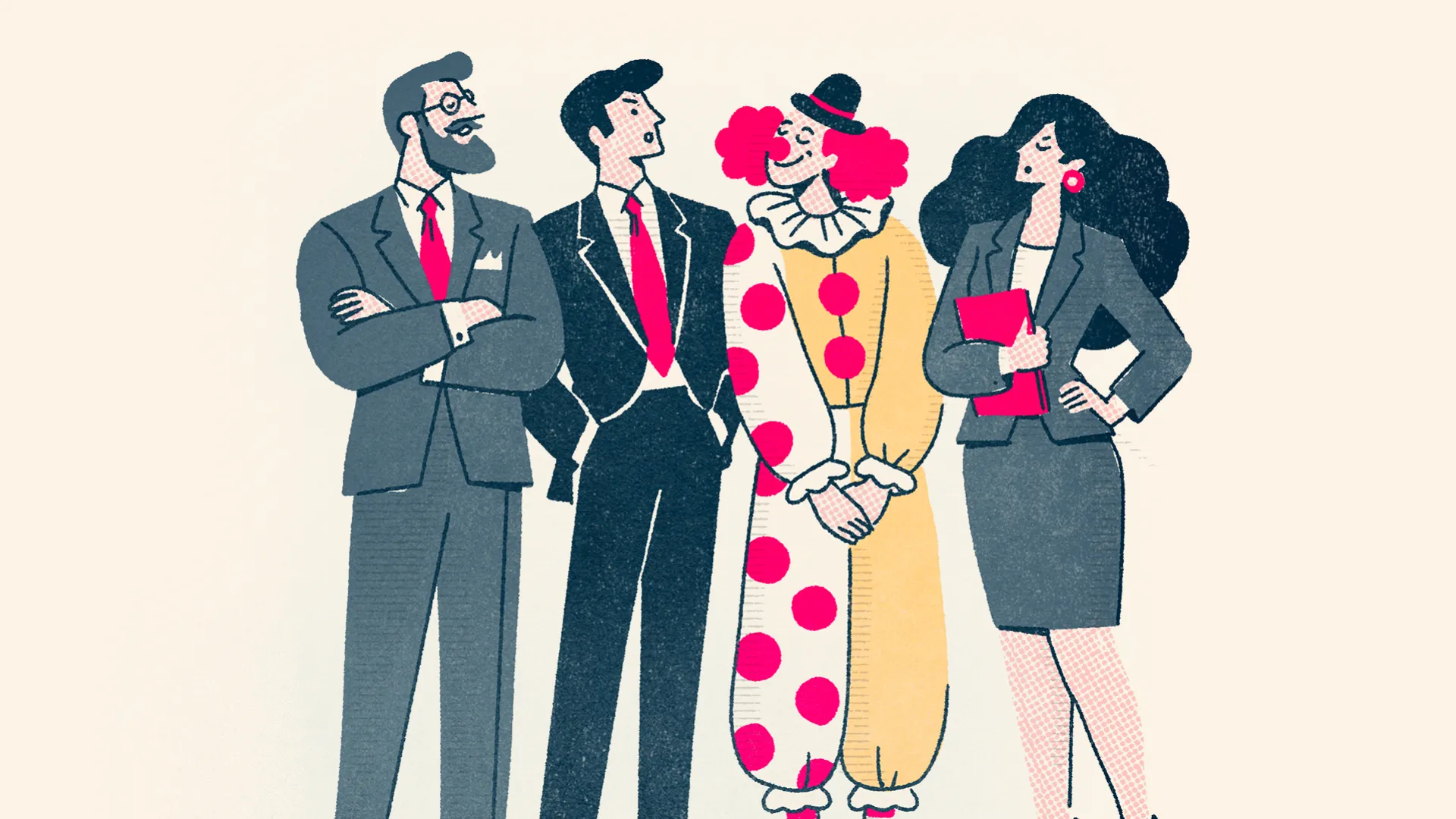
Illustration is one of those things I think can bring an enormous amount of character to a brand. It gives us the freedom to communicate ideas, introduce personality and create imagery that might otherwise be difficult, expensive or practically impossible to achieve through photography. But there's an important distinction between commissioning a lovely illustration and developing an illustration style that can become part of a wider visual identity.
As always, consistency is always an important consideration. We think carefully about how typography, colours, photography and graphic elements work together to create something recognisable, and illustration should really be no different. A single illustration might look fantastic, but the interesting challenge comes when you need another ten, twenty or even a hundred illustrations covering completely different subjects. How do you make sure they all feel like they belong to the same brand, particularly when they're being created months apart or by different people? That's where building an illustration system starts to become particularly useful.

Creating A Visual Language
Much like the wider brand guidelines, a good illustration system establishes a collection of principles that help maintain consistency without making everything look identical. We might define particular rules around line weights, perspective, proportions, colour, texture, shading and the level of detail included in each scene. If people are involved, we need to think about how they're represented, how their proportions work and how different poses and expressions fit within the style. The same considerations apply to objects, environments and the way different elements interact.
That doesn't mean every illustration needs to follow exactly the same formula. Some might use a single colour, while others use the entire brand palette. Some might be incredibly simple, while others contain much more detailed scenes. You might even have several complementary illustration styles within the same identity, each serving a different purpose. The important thing is understanding the rules that connect them and knowing when there's room to adapt. Like most things in branding, it's about establishing enough structure to maintain recognition while leaving enough flexibility to do something interesting.
We also like to think beyond the initial collection of finished illustrations. If a brand is likely to use illustration regularly, it makes sense to consider how the style can expand over time. That could mean establishing a library of reusable objects, characters, shapes or backgrounds, alongside guidance explaining how new illustrations should be constructed. Rather than starting from scratch every time somebody needs a new graphic, they have a foundation to work from, making the process quicker, more consistent and easier to maintain.
Why Illustration Can Be More Useful Than Photography
There are also some very practical reasons to use illustration. Photography is fantastic, and there are plenty of situations where it's absolutely the right choice, but it can struggle when the subject is particularly abstract, sensitive or difficult to communicate visually. This is something we encounter when working with charities, healthcare organisations and businesses offering more complicated services. Sometimes you're trying to explain a process, represent an emotion or introduce a subject that simply doesn't lend itself to a conventional photograph.
A good example is our work on Brain Tumour Hub. The platform brings together information from hundreds of different organisations, all with varying levels of branding and imagery. Some have recognisable logos, others have very little visual material available, and displaying everything together creates an obvious challenge for consistency. Rather than allowing the interface to become a patchwork of unrelated images, we developed a suite of illustrations that could be used as placeholders throughout the directory. They give the cards a recognisable visual language while allowing individual organisations' imagery to be introduced where appropriate. It's a relatively simple solution, but it makes a substantial difference to how coherent the platform feels.

Illustration can also offer advantages for digital performance. Simple vector artwork can often be delivered efficiently as SVG files, allowing it to scale beautifully without losing quality. Motion can also be introduced through lightweight techniques or formats such as Lottie where appropriate. Of course, an overly complicated SVG or animation can become just as problematic as any other poorly optimised asset, so the benefits depend on how it's designed and implemented. But creating an illustration system with digital performance in mind gives us another opportunity to balance creativity with functionality.
And importantly, you don't always need to commission an entirely bespoke illustration library to achieve something similar. There are some excellent stock illustration collections available, and for organisations working with smaller budgets, finding a suitable collection and adapting it consistently can be a perfectly sensible approach. Using an established style, bringing the colours into your brand palette and applying the same visual principles throughout your materials can create a much stronger result than selecting unrelated illustrations whenever something new is needed. Naturally, it's worth checking the licensing and understanding how far you're permitted to modify and reuse the artwork.Our character illustration and animation for Gynesonic. Check out the full case study


More Than A Collection Of Pictures
Ultimately, I don't think every brand needs an enormous library of bespoke illustrations. Sometimes photography is a better fit, and sometimes a carefully chosen collection of stock assets will do the job beautifully. But if illustration is going to become an important part of your visual identity, it's worth considering how it will work beyond the first few applications.
The real value comes from creating something that's recognisable, flexible and genuinely useful. A good illustration system gives an organisation the confidence to develop new content without constantly reinventing the style, while providing enough creative freedom for the imagery to remain interesting and relevant.
At Think, we approach illustration as part of the wider branding process, considering how it works alongside typography, colour, graphic design and digital applications. Whether we're creating a bespoke illustration style from scratch, developing a reusable collection of assets or helping an existing brand bring more consistency to its imagery, the objective is always to create something that works for the organisation rather than simply looks nice in isolation.
If you're developing a new visual identity, refreshing an existing brand or finding that your imagery has become a little disconnected, we'd be happy to help explore how illustration could bring everything together. Sometimes a few carefully considered graphics are all you need. Other times, it's worth building a whole visual language that can grow alongside the brand.