There's a quote I've always loved about branding: "A brand is a promise delivered consistently over time." I think it sums up what makes a brand successful far better than almost anything else. It's not about having one incredible advert, a beautiful logo or a particularly impressive website. It's about what you promise people, how you make them feel and whether you can deliver that same experience time and time again.
Think about that friend who always says they're five minutes away but turns up fifteen minutes later. The first time, you probably don't give it much thought. By the fifth, you've already started adjusting your expectations. Or imagine a business that promises next-day delivery but consistently takes three days. Regardless of how confidently it talks about reliability, your experience tells you something different. We make these little judgements constantly, often without realising it, and they gradually shape how we perceive the people and businesses around us. Branding works in exactly the same way. Every interaction either reinforces the promise or starts to undermine it.
A brand should work like a film score
I've always thought a good way to understand brand consistency is to think about a film score. Throughout a film, the story moves between different locations, emotions, characters and moments. One scene might be full of tension, another might be wonderfully uplifting, and another might be quiet and reflective. The music has to respond to each of those moments, changing its tempo, arrangement, intensity and sometimes its entire character. Yet underneath it all, there's something familiar that connects everything together.
Imagine watching a film where exactly the same piece of music played throughout every scene, regardless of what was happening. It would become repetitive pretty quickly, and more importantly, it would stop supporting the story. A good score can change dramatically while still feeling like it belongs to the same film. Themes return in different forms, familiar ideas are interpreted in new ways and the music adapts to the moment without losing its identity.
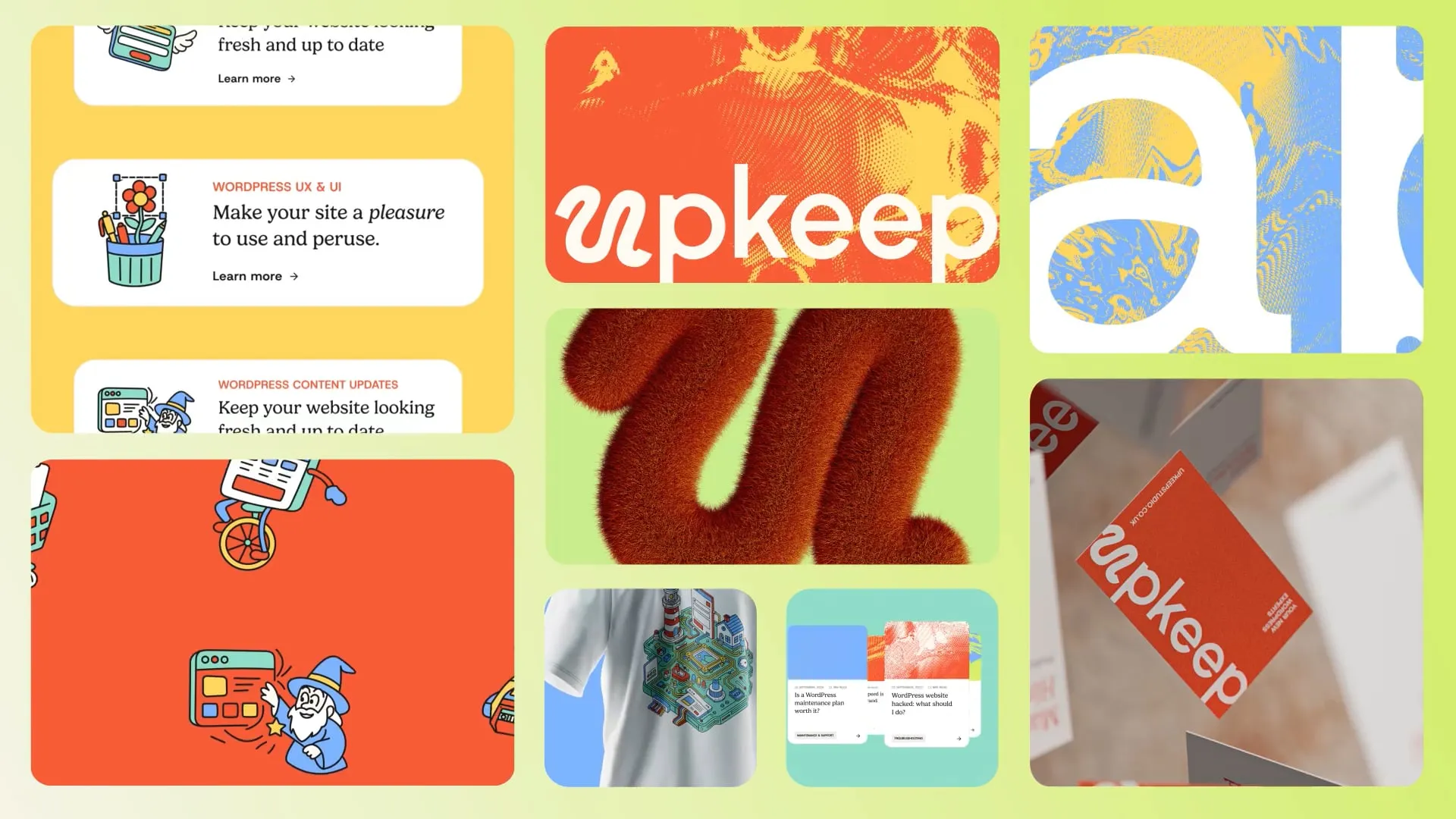
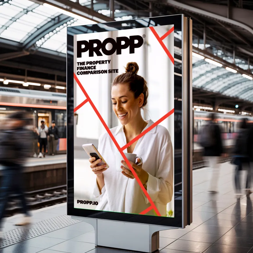
I think a good brand should work in much the same way. A website doesn't need to look exactly like a brochure. An advertising campaign doesn't need to use the same composition as a presentation, and an illustration doesn't necessarily need to follow the same visual approach as a piece of photography. Different formats, audiences and situations call for different responses. But they should all carry something recognisable underneath, whether that's a particular character, visual rhythm, way of communicating or underlying idea. What connects them is the brand strategy, the values and the promise you're trying to deliver. The visual identity, tone of voice and wider design system are the tools you use to bring that promise to life.

Guidelines should guide, not dictate
We work on brands every day at Think, across different sectors, scales and budgets. Some organisations are creating an identity for the first time, while others have decades of history behind them. One thing I've learned is that no matter how comprehensive your brand guidelines are, they'll never account for every possible application.
I'm a big believer in guidelines. We create them, use them and encourage our clients to take them seriously. But they're called guidelines for a reason. Unless you're planning to produce a 300-page document containing every conceivable combination of colour, typography, imagery, format and layout, there will always be situations that require a little judgement. And sometimes following the rules too closely can actually make the result worse.
Perhaps 2 approved colours don't provide sufficient contrast when they're used together. Maybe a beautiful display typeface becomes difficult to read at smaller sizes. Perhaps an illustration style needs adapting to communicate something particularly complex, or a rigid layout simply doesn't suit the content. You could follow the guidelines perfectly and still produce something that doesn't work.
This is where understanding the thinking behind the brand becomes so important. Rather than treating guidelines as a checklist, I'd encourage anyone working with an identity to understand its foundations first. What does the organisation stand for? What are its values? What does it want people to feel? Which elements are essential to its character, and which can adapt? Once you understand those things, you can make better decisions about how to use the tools available to you. You remain faithful to the identity without becoming so rigid that every application feels like another verse of the same song.
The real world is where brands get tested
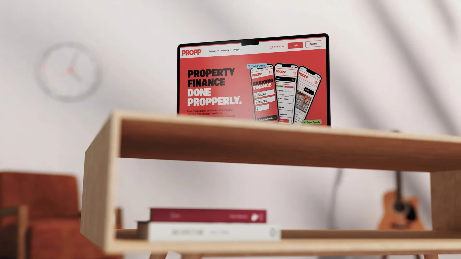
It's relatively easy to make an identity look consistent across a handful of carefully art-directed mock-ups. The interesting part comes when it has to function in the real world. Websites are a particularly good example because they introduce constraints that don't necessarily exist in a printed brochure or brand presentation. Typography has to adapt to different devices, colours need sufficient contrast, content changes constantly and animation needs to work without affecting performance or accessibility. Something that looks fantastic as a static concept might be completely impractical when it's built and used by real people.
That doesn't mean abandoning the creative idea. It means understanding what makes it work and finding another way to express it. If the brand is built around clarity, there's little sense in forcing a particular typographic treatment into a website if it makes the content harder to read. If the identity is meant to feel considered and effortless, loading the website with heavy animation that makes everything sluggish isn't delivering on that promise either. The design might be visually consistent with the guidelines, but the experience isn't consistent with the brand.
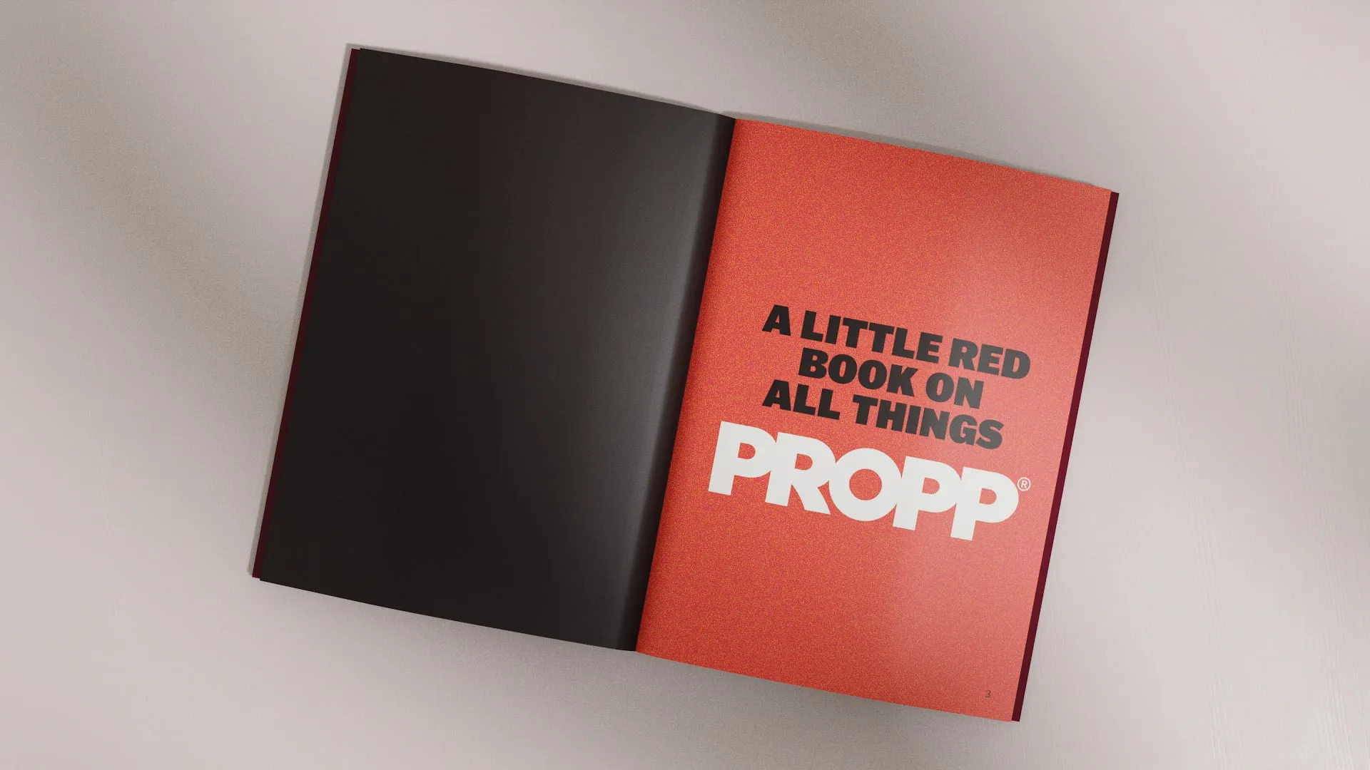
The same applies to printed materials, motion graphics, illustrations, presentations and everything else an organisation produces. Each medium has its own strengths and limitations. A strong brand identity needs enough flexibility to make the most of them while retaining the underlying character that connects everything together. That's why we put so much emphasis on building useful design systems rather than simply creating a collection of attractive assets. The system should establish the foundations, provide the tools and allow people to adapt them intelligently. Much like that film score, it needs room to change without losing the thread.

It's not just About How Things Look
When I took over the day-to-day running of Think, brand consistency was something I wanted us to address internally. Like plenty of businesses that have evolved over time, we'd accumulated different ways of doing things. There were old proposal documents floating around, some nearly 10 years old, typefaces that were no longer part of our identity and colours that had slowly been changed or interpreted differently. Individually, none of these things seemed particularly significant, but collectively they created a slightly fractured impression of who we were.
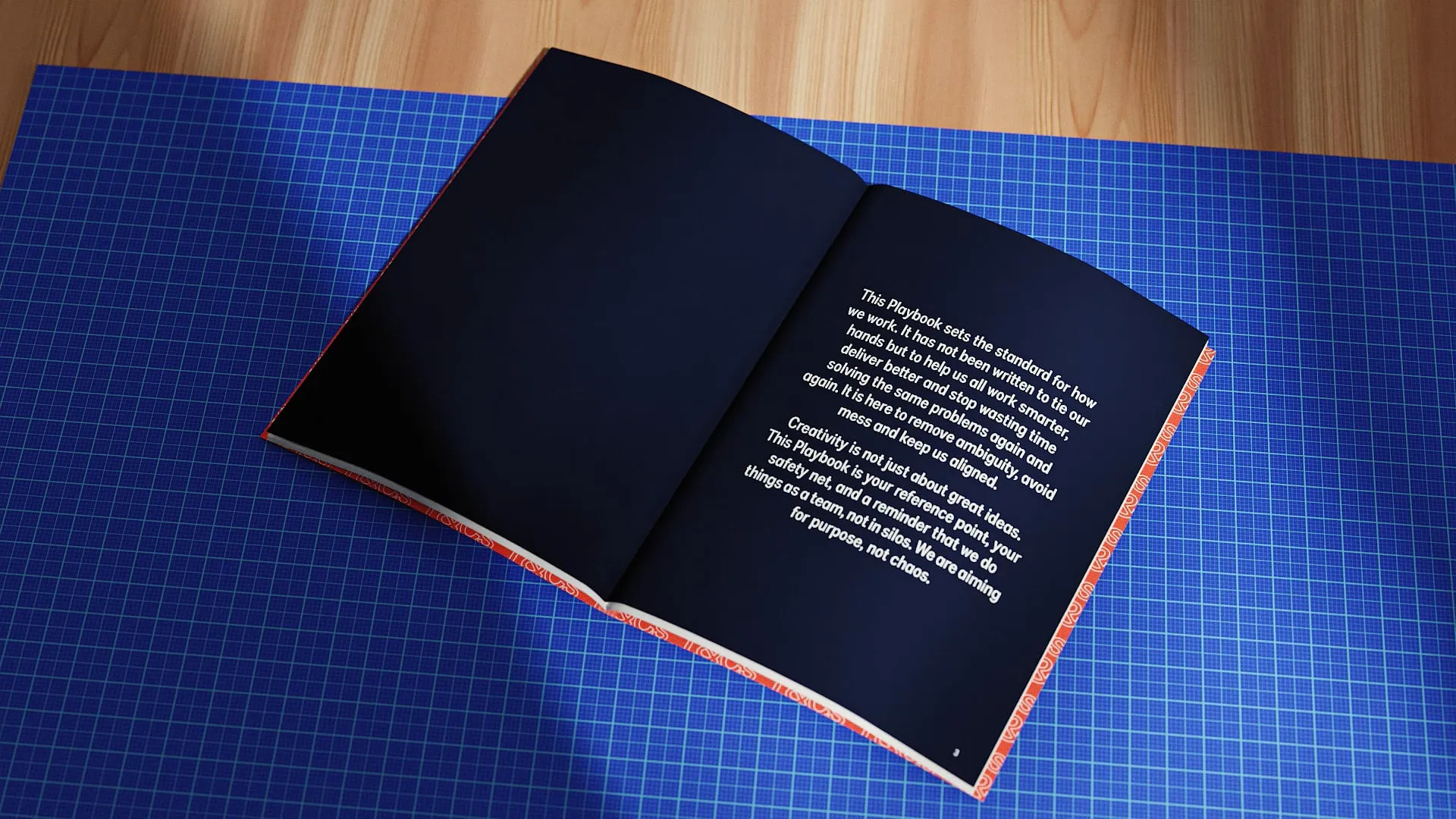
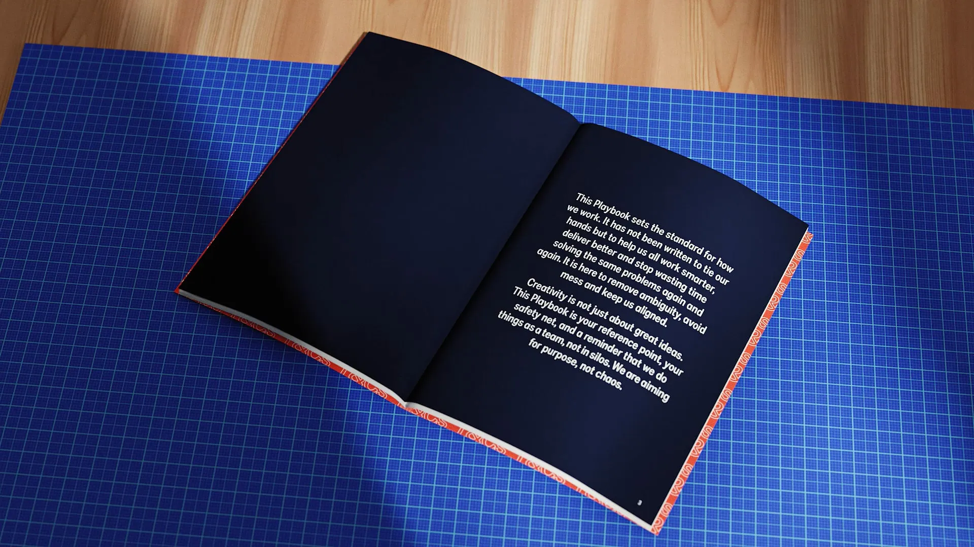
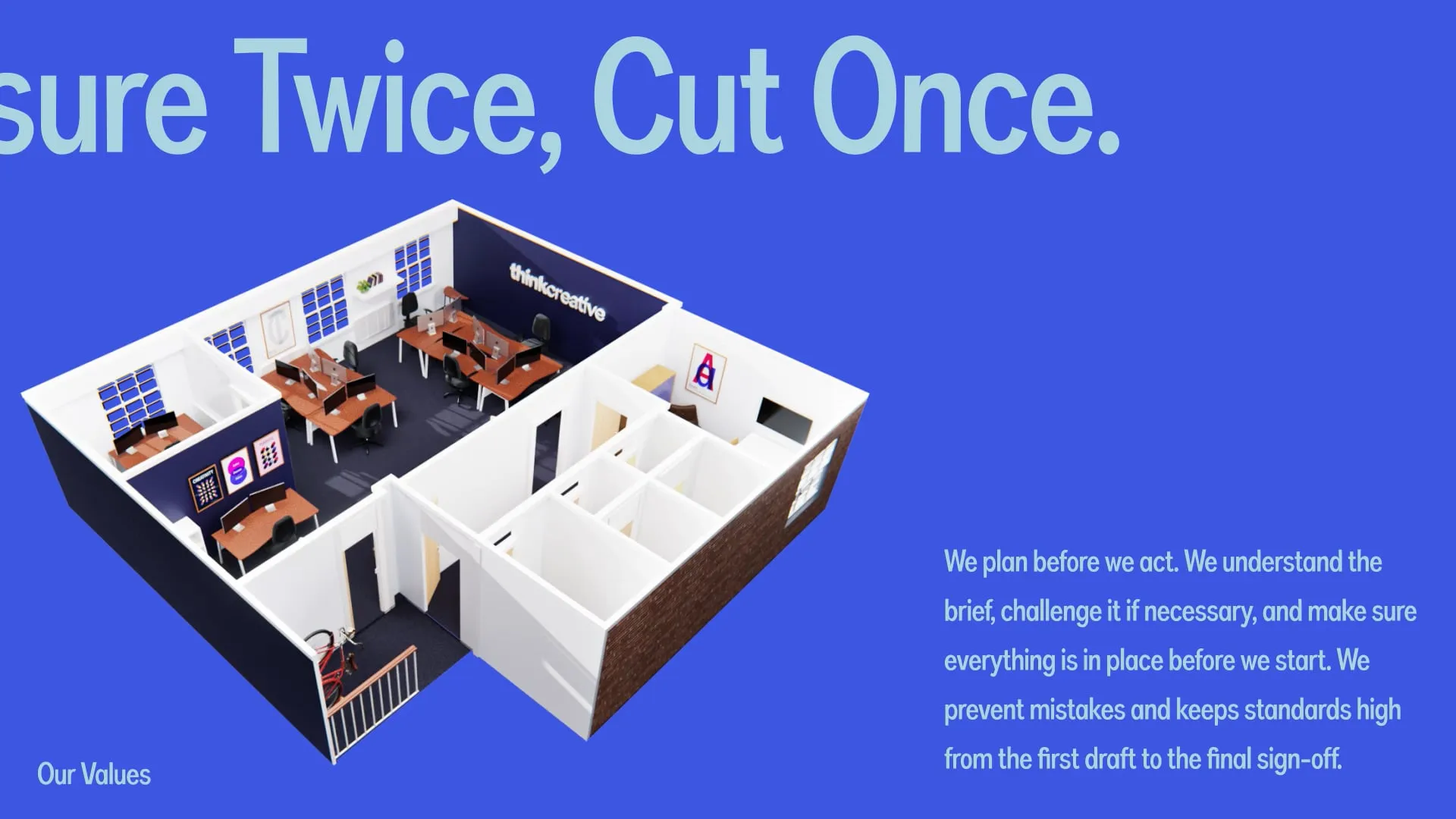
We could have stopped at updating the visual identity, creating new templates and making sure everyone used the right fonts. Instead, we looked at the experience of working with Think as a whole. Alongside developing a much more comprehensive brand framework, we created an internal playbook covering how we approach projects, communicate with clients, conduct meetings and maintain standards throughout our work. We wanted the same care and consideration that went into the creative output to be reflected in the way we actually operated.
That doesn't mean making everyone behave identically. Everyone has their own personality and strengths, and that's part of what makes a creative business interesting. But the principles behind the experience should be consistent. Whether somebody is speaking to a designer, developer, project manager or creative director, they should encounter the same underlying values and commitment to the work. There's little point presenting yourself as a thoughtful, dependable organisation if that experience changes completely depending on who picks up the phone.
For me, this is where brand strategy becomes much more than a positioning exercise. It should influence decisions throughout the business, not just the marketing department. A brand promising reliability needs to be reliable. A brand promising creativity needs to demonstrate it. A brand built around attention to detail needs to pay attention to the details, even when they're not particularly glamorous. The promise has to exist beyond the presentation.
AI Brings Another Layer Of Complexity
AI makes this conversation particularly interesting because it's becoming easier than ever to produce enormous amounts of marketing content, imagery, presentations and design assets. For organisations without substantial marketing budgets or dedicated creative teams, that's a genuinely exciting opportunity. I don't believe every business needs to engage an agency every time it wants to create a social post or update a presentation, and if technology makes good creative work more accessible, that's something worth embracing.
But accessibility doesn't automatically create consistency. An AI-generated image might look fantastic but bear little resemblance to your established visual identity. A piece of copy might be perfectly competent but sound nothing like your organisation. You might be producing three times as much content while gradually losing the qualities that made your brand recognisable in the first place.
The answer isn't necessarily to avoid AI, but to use it with the same consideration you'd apply to any other tool. Give it your tone-of-voice documentation, establish clear instructions, supply examples of good work and use your actual brand assets wherever possible. Understand how to prompt effectively and choose tools that are appropriate for the task, but don't assume they'll interpret everything correctly. Typography, colour, composition, messaging and factual accuracy still need checking. Perhaps most importantly, think about whether the output actually reflects your values. If authenticity, honesty and transparency are fundamental to your brand, presenting artificial people or situations as genuine experiences could undermine the very things you're trying to communicate.
AI can be enormously useful in helping organisations apply their brand more efficiently, but it still needs direction and judgement. Having the tools to make something doesn't necessarily mean the result is right for the brand.
Building A Brand That Holds Together
Ultimately, I don't think brand consistency comes from having the strictest guidelines or making every piece of communication look identical. It comes from understanding what makes the brand what it is, then using that understanding to make considered decisions wherever it appears.
The strongest brands have a clear promise, a recognisable character and enough flexibility to respond to the world around them. Their visual identity can adapt, their tone can change to suit the conversation and their design systems can accommodate different formats without everything becoming disconnected. More importantly, the experience people have with the organisation reinforces the things it claims to stand for.
That's the thinking behind how we approach branding at Think. We work with organisations at different stages of their journey, developing brand strategies, visual identities, guidelines and design systems that do more than look good in a presentation. We want them to work across websites, print, campaigns, motion and the everyday interactions that shape how people experience a business.
If your brand has started to feel inconsistent, or you're finding it increasingly difficult to apply across different teams and platforms, the answer isn't necessarily to start again. Sometimes the foundations are already strong, but the system supporting them needs a little more thought. That's something we can help you unpick, strengthen and build upon, whether that means refining an existing identity or creating something new.
Because a brand doesn't need to play the same tune everywhere. It just needs to make sure that, however the arrangement changes, people still recognise the music.