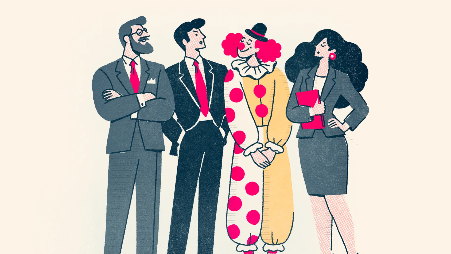
"We need a rebrand" is something we hear fairly regularly, but it's one of those statements that can mean an enormous number of different things. Sometimes a business has completely changed direction, moved into a different market or outgrown the identity it originally started with. Other times, the logo just feels a little dated, the marketing materials have become inconsistent or the website no longer reflects the quality of the organisation behind it. These are all perfectly valid reasons to revisit a brand, but they don't necessarily require the same solution, and that's where the distinction between a rebrand and a brand refresh becomes particularly interesting.
I've always thought of rebranding and refreshing as sitting on a spectrum rather than being two entirely separate things. At one end, you might make relatively subtle adjustments to the typography, refine the logo, introduce a few new colours and give the identity a little more flexibility. At the other, you might change the name, positioning, proposition, tone of voice and entire visual identity. Somewhere in the middle are organisations that retain their name, their familiar colours and much of their existing character, but substantially change how the brand looks, communicates and behaves. None of these approaches is inherently right or wrong. What matters is understanding why you're making the change in the first place and how far you actually need to go to achieve it.
Start With The Business, Not The Logo
I think one of the biggest mistakes you can make when approaching a rebrand is assuming that the visual identity is necessarily the problem. Branding is about creating recognition and emotional connections with an audience, and those connections are built over time through everything an organisation does. If you're still serving the same customers, offering broadly the same services and working towards the same objectives, throwing away a recognisable identity purely because it feels a little tired could actually do more harm than good. You might have years of familiarity, trust and goodwill attached to particular elements of the brand, and replacing them doesn't automatically make the organisation more relevant.
But there are also times when the organisation has fundamentally moved beyond the identity it originally created. Perhaps the business has changed ownership, entered a new market, developed a completely different proposition or grown into something that no longer resembles where it started. Perhaps the culture, leadership and ambitions have changed so significantly that the existing identity is telling a story that simply isn't true anymore. In those situations, a more substantial rebrand can create the opportunity to establish a clearer direction, communicate a renewed sense of purpose and introduce the organisation to audiences it previously struggled to reach.
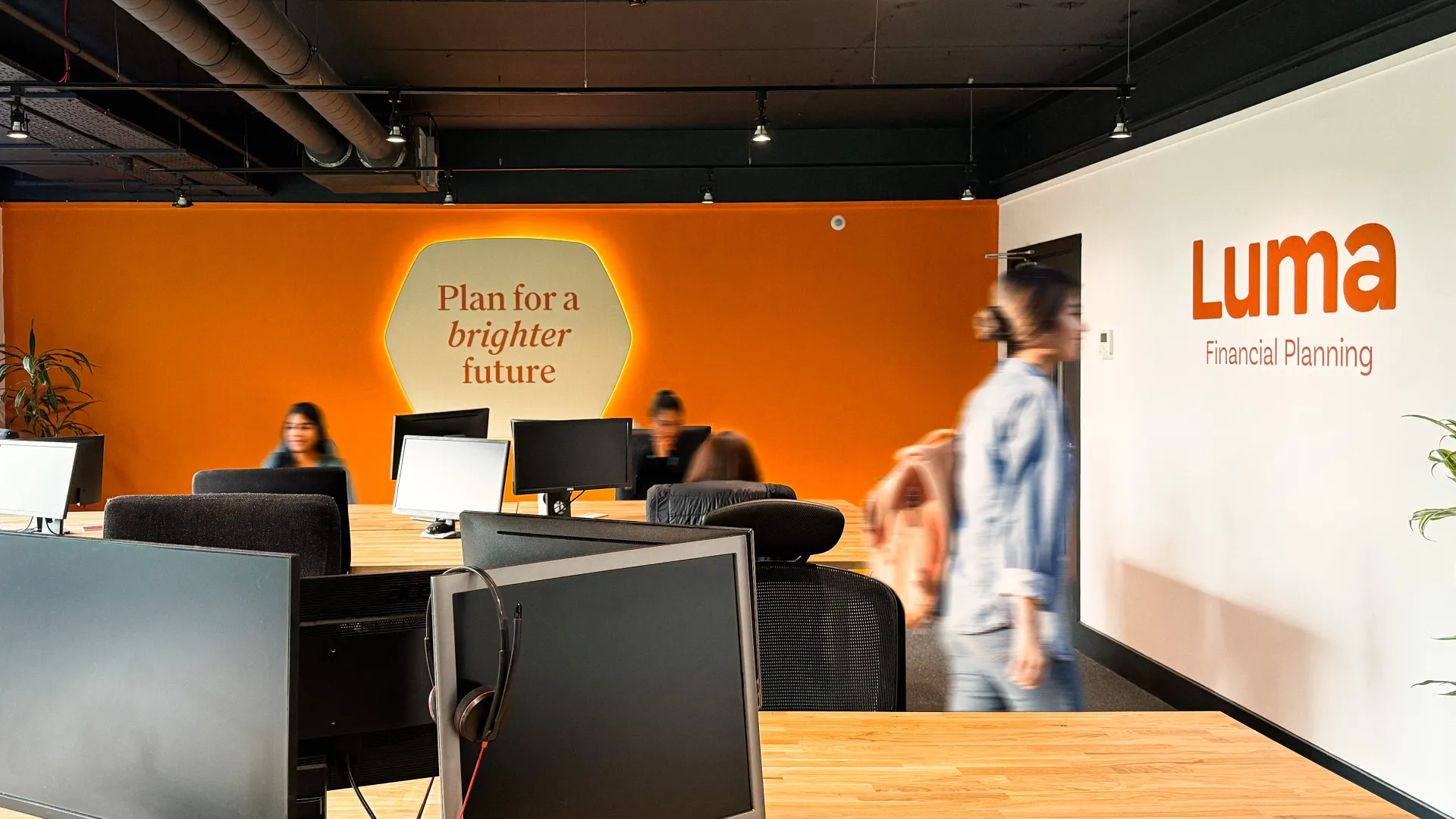
We've experienced this with several projects at Think, and what's particularly interesting is how different the answers can be depending on the circumstances.
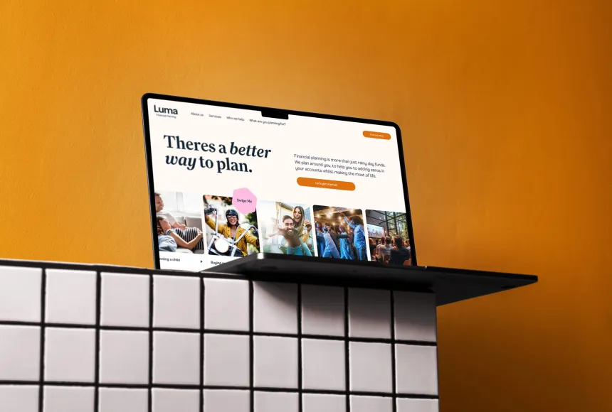
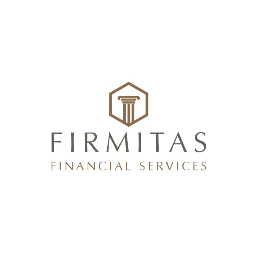
Luma is a good example of a business that had genuinely moved beyond its original identity. Previously known as Firmitas, the organisation had developed considerably from the business and name it had inherited years earlier. Its team, ambitions and approach had evolved, and the existing identity no longer represented where they wanted to go. The decision to become Luma was therefore about considerably more than creating a new logo. It involved a new name, positioning, values, tone of voice and visual direction, giving the organisation a clearer identity that reflected the people behind it and supported its ambitions for the future.
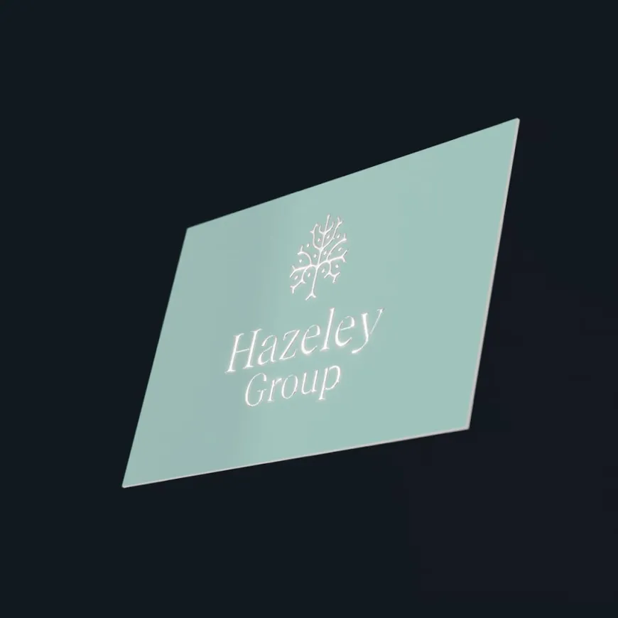
We encountered a different but equally significant challenge with Hazeley Group, previously Humphrey Farms. The business had sold its agricultural interests and was concentrating on property development, so retaining a name and identity rooted in farming no longer made sense for the organisation it had become. The rebrand allowed us to establish an identity that reflected its new commercial direction, while still respecting the history that had helped build the business in the first place.
These are examples of where a more comprehensive rebrand made sense because the organisation itself had changed. The objective wasn't simply to create something more attractive. It was to bring the brand back into alignment with the business, its audience and where it wanted to go next.
Protecting The Things That Still Work
One of the challenges with any branding project is knowing what to change and, perhaps more importantly, what to keep. As designers, it's incredibly tempting to get swept up in creating something completely new. There are always opportunities to experiment with typography, colour, composition and new ideas, and producing a dramatically different identity can be enormously exciting. But I think good branding requires a little more restraint than simply making the biggest possible change.
An existing brand has history. People may recognise its colours, remember its symbol or have a particular emotional connection with something that has been part of the organisation for years. If those elements still have value, there's very little reason to abandon them simply to demonstrate how much creative work has gone into a rebrand. The challenge is to understand which elements are genuinely worth protecting and how they can be developed into something that better serves the organisation today.
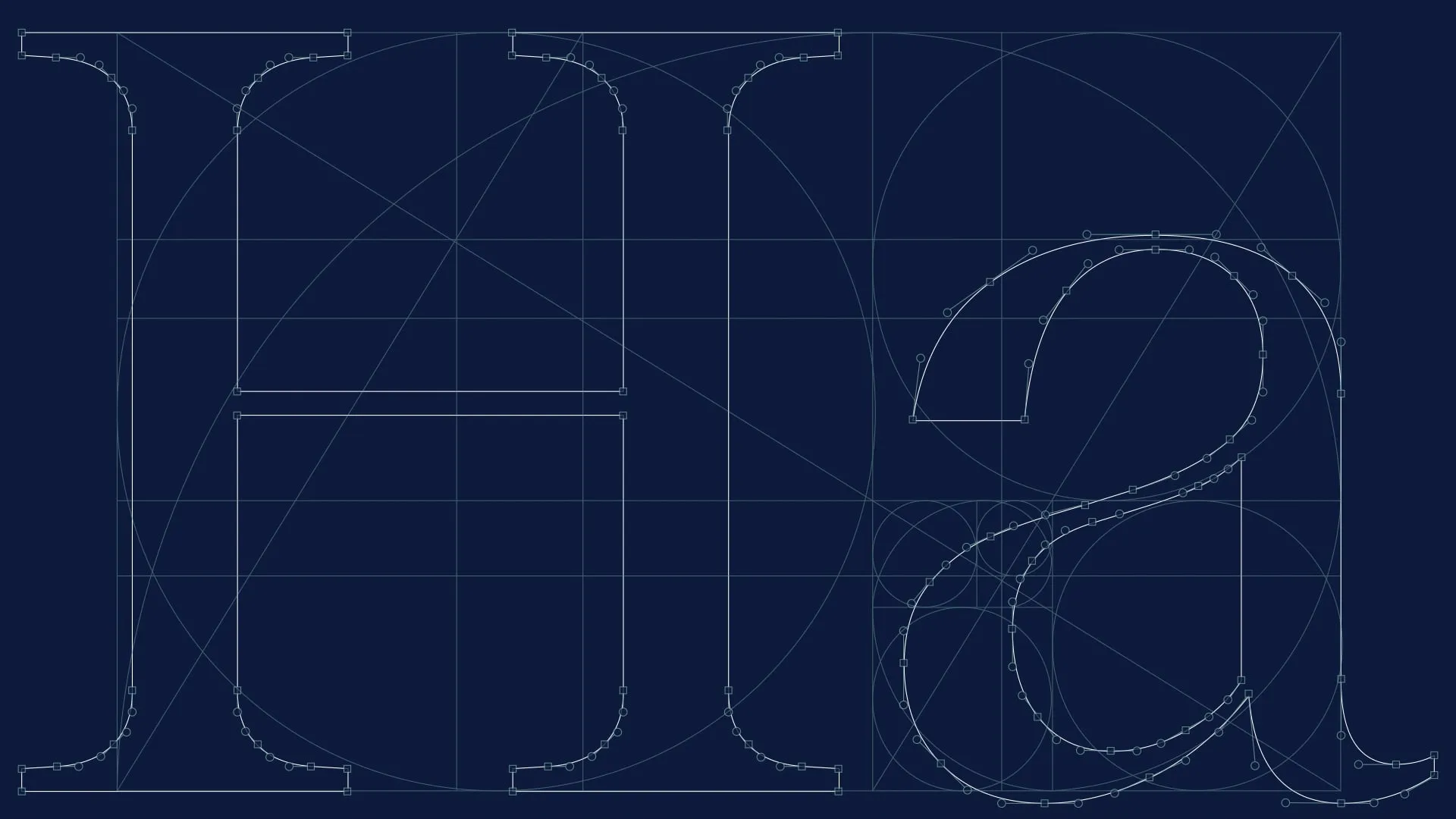
Both Luma and Hazley demonstrate how we've approached that balance. Although the identities changed substantially, we deliberately retained subtle references to their heritage. The original Veritas identity featured a hexagon, which we developed into the Luma-hex, a distinctive graphic device that could be used throughout the new visual identity. Similarly, the Humphrey Farms identity featured an egg, and we carried a reference to that shape into the leaves of the Hazley Group identity to pay homage to their heritage as chicken farmers. These aren't necessarily details that every customer will consciously recognise, and that's perfectly fine. They're considered connections between where the businesses have come from and where they're heading, preserving something meaningful without allowing the past to dictate the future.
That sense of continuity is particularly important when an organisation has an established audience, long-standing customer relationships or stakeholders who have invested years in building the business. Changing everything overnight can introduce unnecessary uncertainty, particularly when the underlying proposition remains largely the same. Of course, there are circumstances where a dramatic change is exactly what's needed, but that should come from the strategic requirements of the organisation rather than a desire to make everything look completely different.
Sometimes A Refresh Can Do The Heavy Lifting
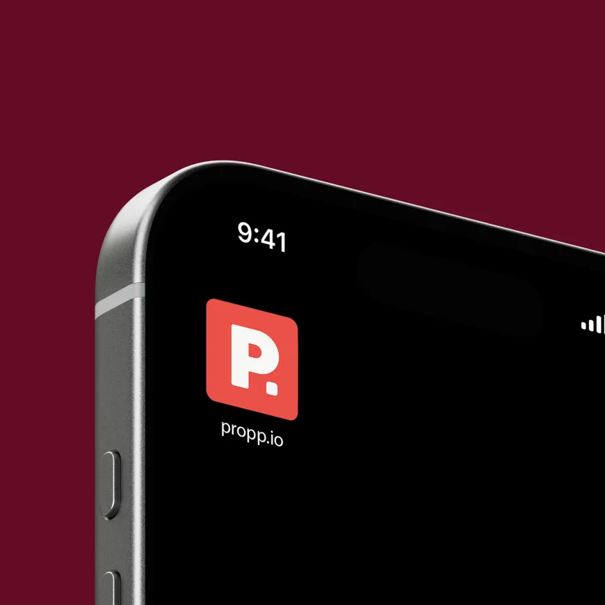
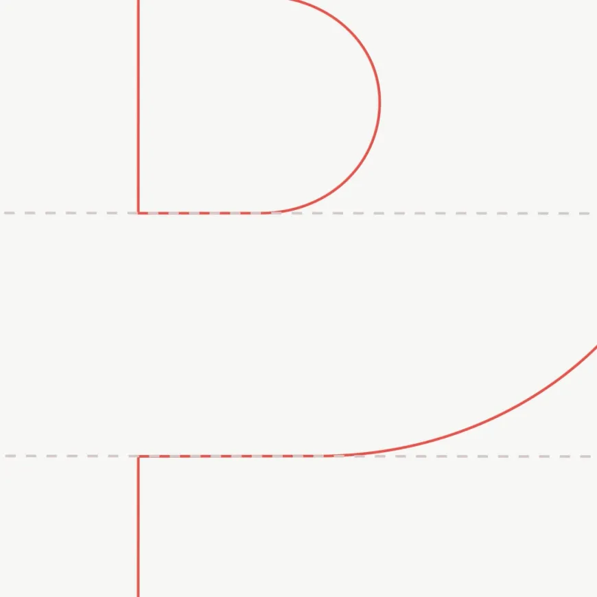
Propp is an interesting example of an organisation that needed a different kind of approach. The business had grown considerably since its original identity was developed, and over time the proposition, the digital products and the people behind the organisation had evolved. The branding had started to feel a little dated, and as different parts of the business developed, the visual identity had gradually become fragmented. It wasn't necessarily that the original thinking was wrong, but the organisation had moved forward while parts of its identity had stayed where they were.
When we approached the project, I didn't want the objective to simply be making Propp look better. Of course, improving the quality of the visual identity was important, but I felt the more interesting ambition was making Propp feel more like Propp. We wanted the identity to reflect the people working there, the character of the organisation and the proposition it had developed into, rather than imposing something new purely for the sake of change.
That meant revisiting the original thinking with fresh eyes, understanding what still worked and identifying where the identity needed more personality, clarity and consistency. Alongside refreshing the visual language, we developed a more comprehensive digital design system that could bring the various parts of the business together. This gave Propp a stronger foundation for its website and digital products, helping everything feel connected while providing the flexibility to develop new functionality and applications over time.
I think this is where a brand refresh can become particularly valuable. It gives you the opportunity to reassess the decisions that were made when the identity was first created, but with the benefit of everything you've learned about the business since. You can refine the things that aren't quite working, introduce greater consistency and build a system that better supports the organisation without necessarily losing the recognition it has already established.
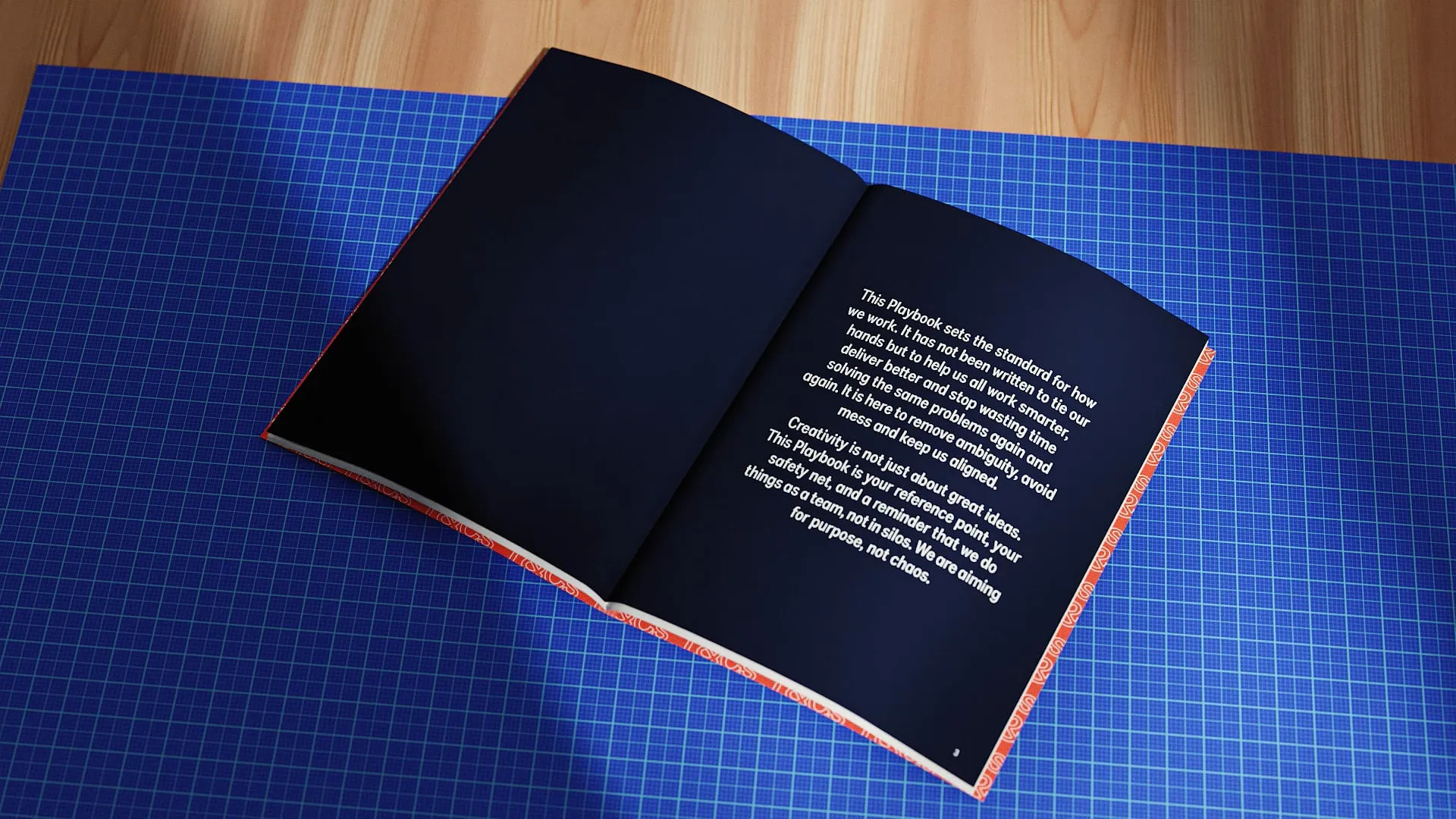
And sometimes the refresh doesn't need to be particularly dramatic at all. It might involve developing better brand guidelines, improving typography, refining a colour palette or creating templates and design systems that make the identity easier to use. If the brand strategy and visual foundations are still strong, there's no reason to replace them simply because the marketing materials have become a little untidy.
Finding The Right Level Of Change
When we're working with clients who are considering a rebrand or refresh, I find it useful to start with three fairly straightforward considerations. Has the organisation changed? Has its audience changed? And has what the brand needs to communicate changed? They're simple questions, but exploring the answers properly can reveal quite a lot about what the project actually needs to achieve.
It's also important to understand the commercial reasons behind the change. Perhaps you're trying to attract a different type of customer, improve your position in a competitive market, support a new service offering or bring several parts of an organisation together under one identity. Maybe the business is performing well, but the brand no longer reflects its quality or ambitions. Those objectives should influence the creative decisions, because a successful rebrand isn't simply about whether people prefer the new logo. It's about whether the identity helps the organisation move in the direction it wants to go.
We want to understand which direction feels right for the organisation, which best reflects its values and which has the strongest connection to where it wants to go. A design can look incredible and still be completely wrong for the business behind it. Equally, something that initially feels less dramatic might prove far more valuable because it builds upon what people already recognise and trust. That's why we encourage clients to think beyond their immediate aesthetic preferences and consider how the identity will work across the business, its marketing, digital platforms and everyday communications.

The Right Change, For The Right Reasons
Ultimately, I don't think there's a definitive point where a refresh becomes a rebrand. The terminology is useful for describing the scale of a project, but it's much less important than understanding what the organisation needs and choosing an approach that makes sense. Sometimes that means starting again with a new name, proposition and identity. Sometimes it means keeping almost everything and making a series of carefully considered improvements. Quite often, the most interesting answer sits somewhere in between.
What I would always encourage is resisting the temptation to change something simply because you can. A brand is the accumulation of people's experiences, expectations and associations with an organisation, and those things have value. The job of good branding is to understand that value, protect the parts that still work and make the changes necessary to support what comes next. At Think, we work with organisations at every stage of that journey, from complete rebrands and new visual identities to more considered brand refreshes, guidelines and design systems. Our approach is always to understand the business first, explore what's possible and create something that genuinely supports its ambitions, whether that requires a dramatic transformation or a little more finesse.
If you're considering a rebrand but aren't entirely sure how far you need to go, that's actually a very good place to start the conversation. We'd much rather help you understand what needs changing before deciding what needs designing. After all, the aim isn't to make your organisation look like somebody else. It's to make it feel more like the business it's become, while giving it the confidence and flexibility to become whatever comes next.