Luma
Planning for a brighter future
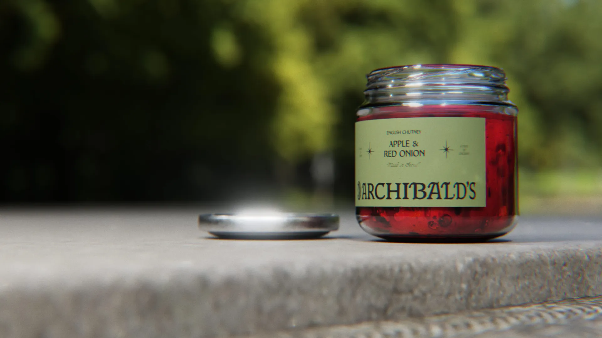
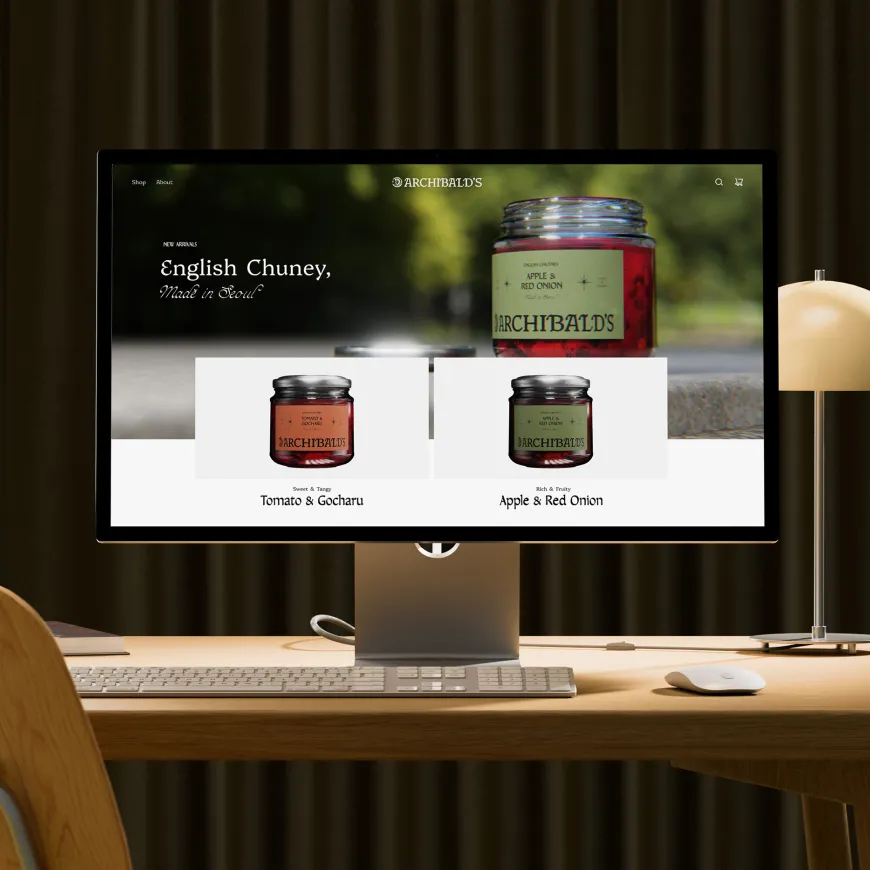
Chutney is a staple of the British cupboard. In Korea, it is still largely undiscovered. That gap gave us the opportunity to create something with real appetite: a small-batch English chutney brand built for a market that values provenance, aesthetics, specialty food culture and products with a story worth sharing. Archibald’s was created to help introduce English-style chutney to Korean audiences, giving the brand enough charm, credibility and visual distinctiveness to build momentum, attract interest and support future investment.
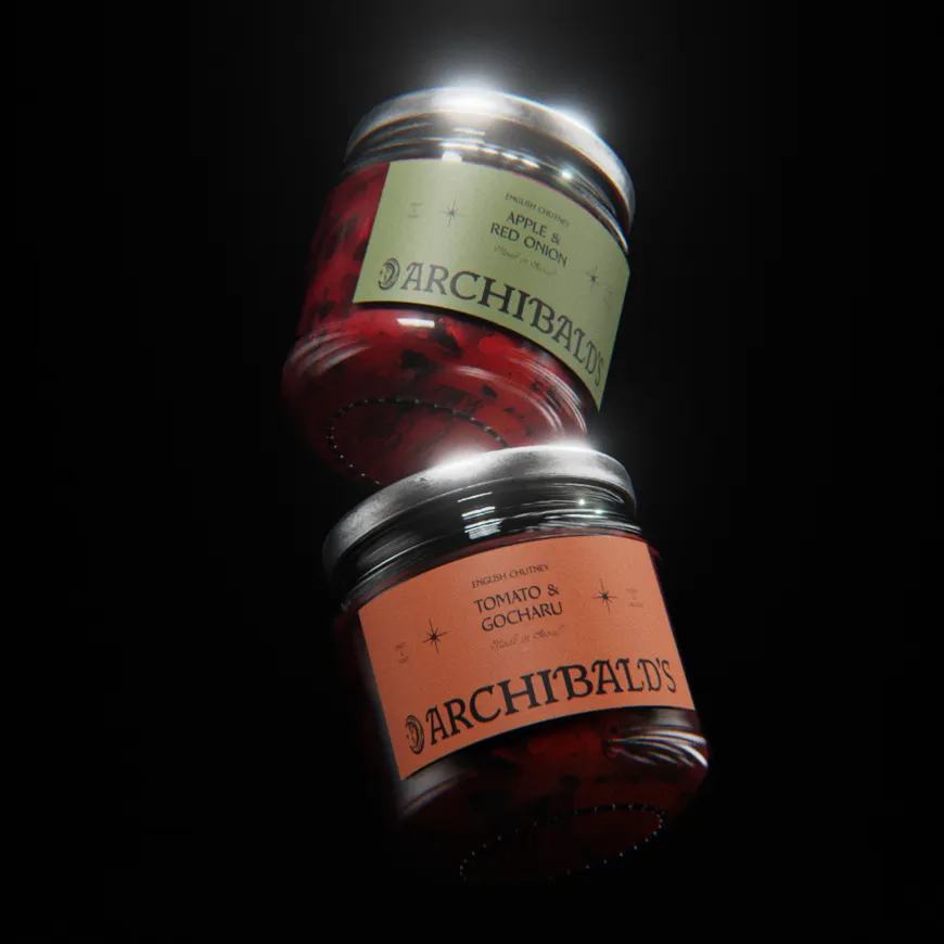

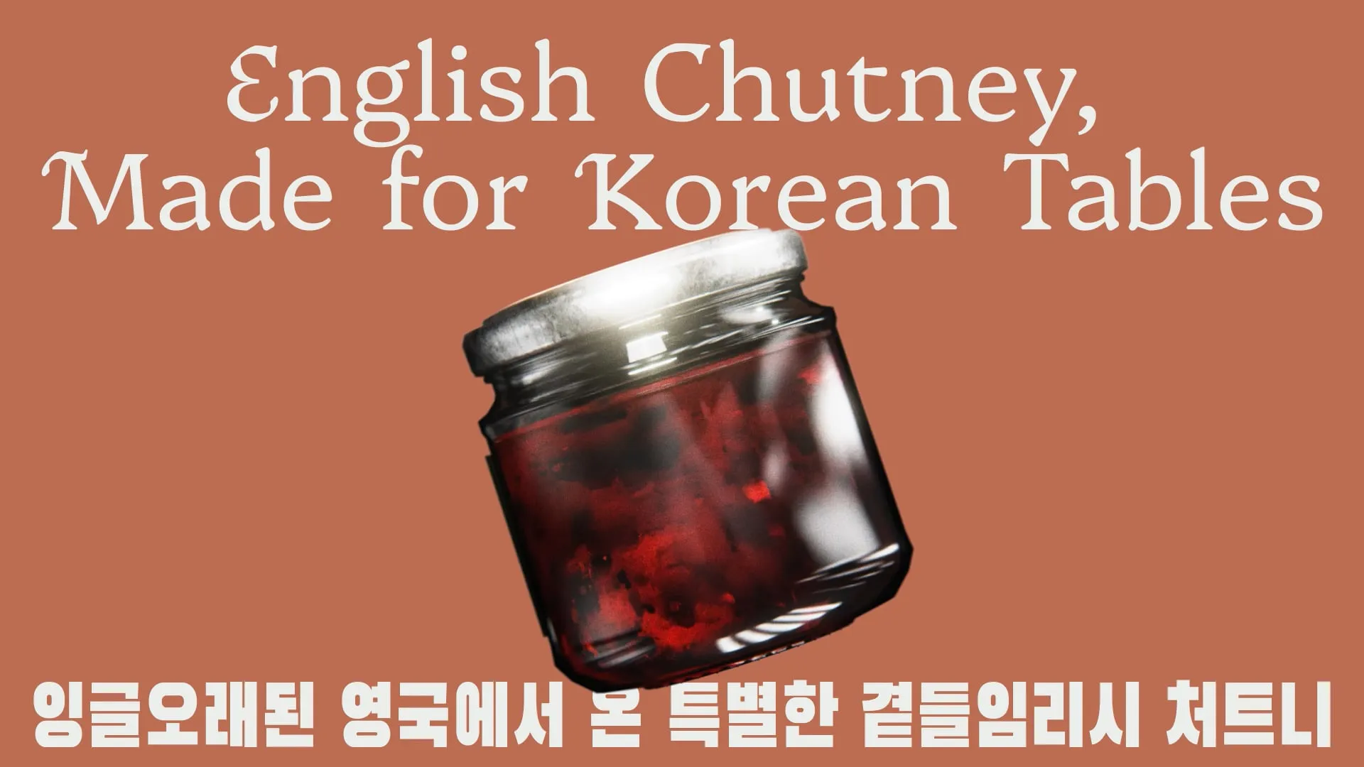
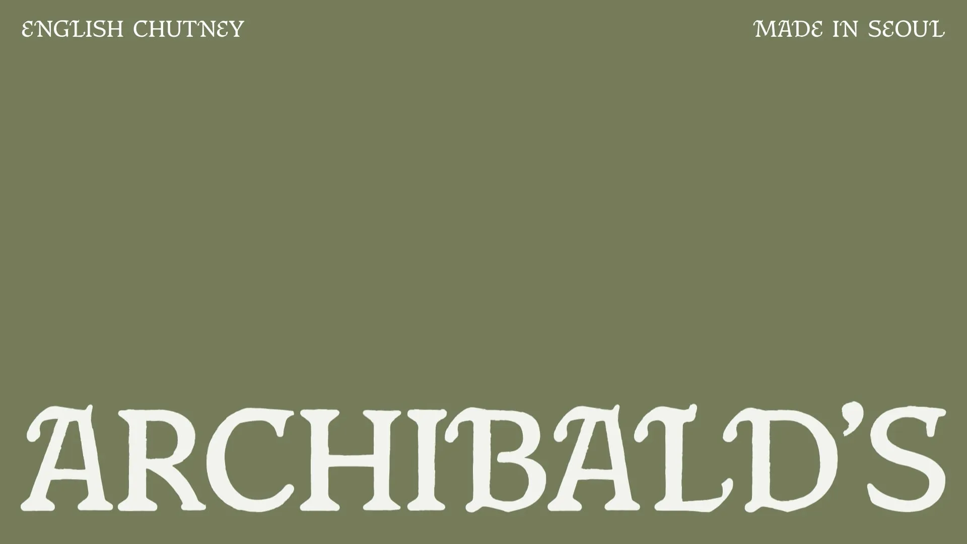
The idea was simple: if chutney was going to land in Korea, it could not feel like a novelty import or a dusty heritage product. It needed to feel premium, curious and culturally desirable. So we built the brand around the romance of English folklore, old orchards, celestial mythology and hand-pressed craft. A taste of England, but through a more magical lens. Familiar enough to feel trustworthy. Strange enough to feel worth picking up.
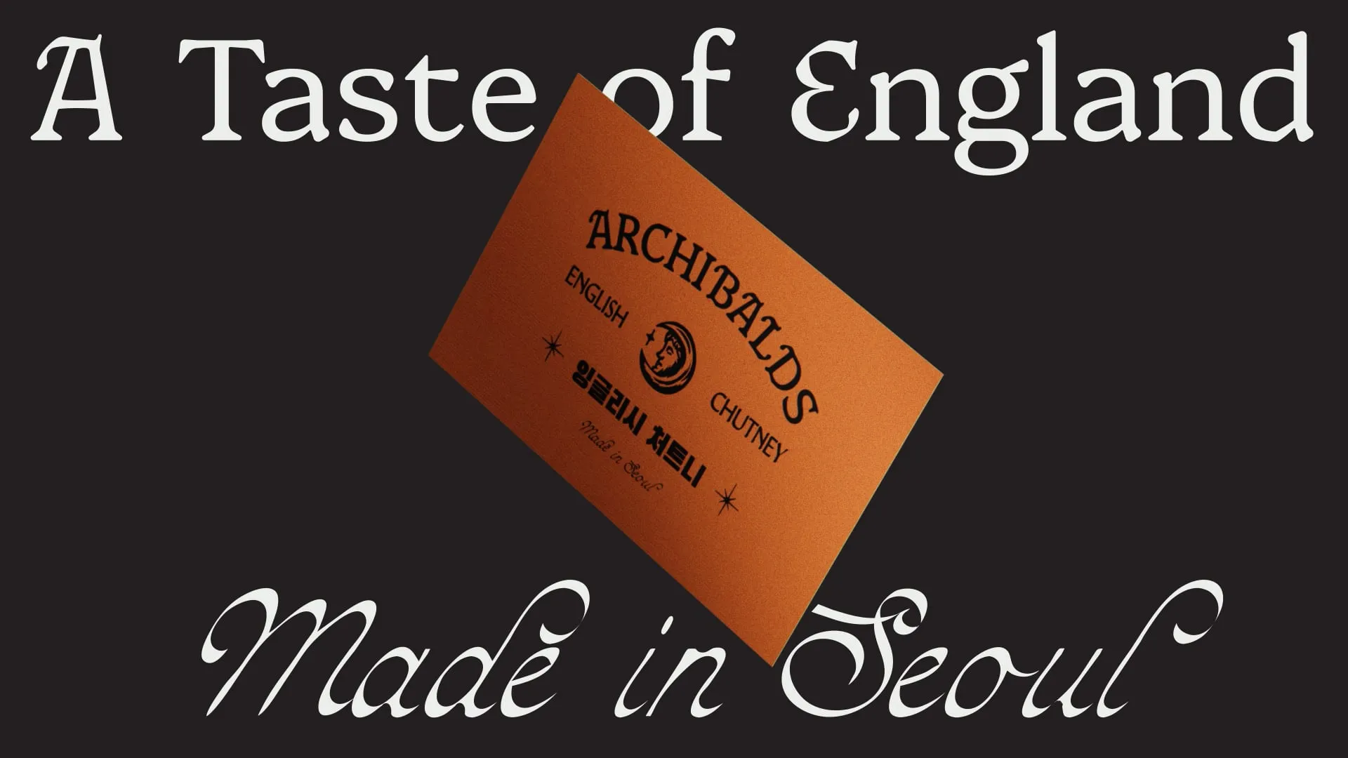
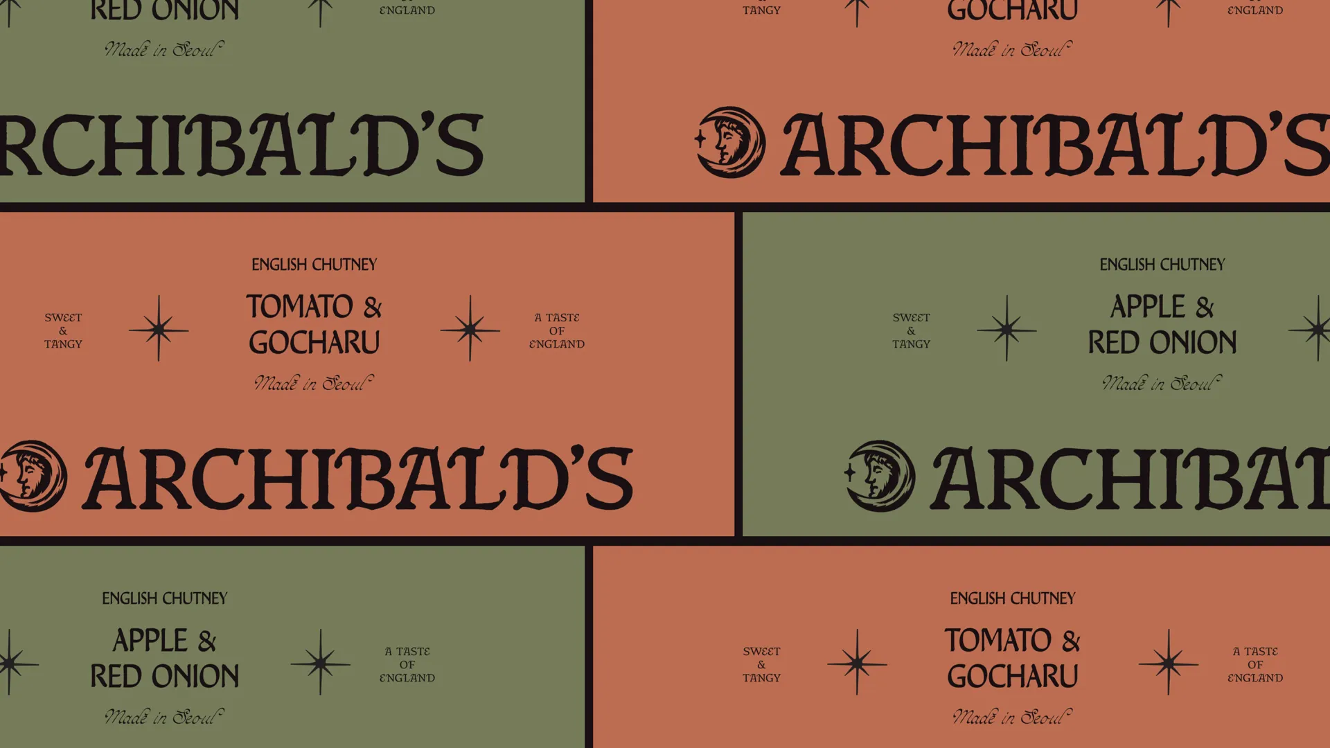
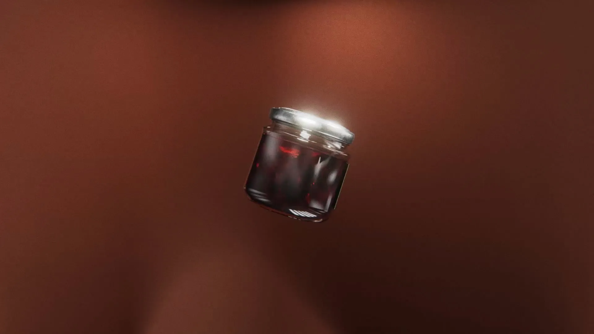
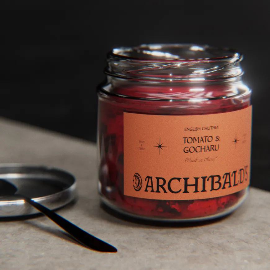
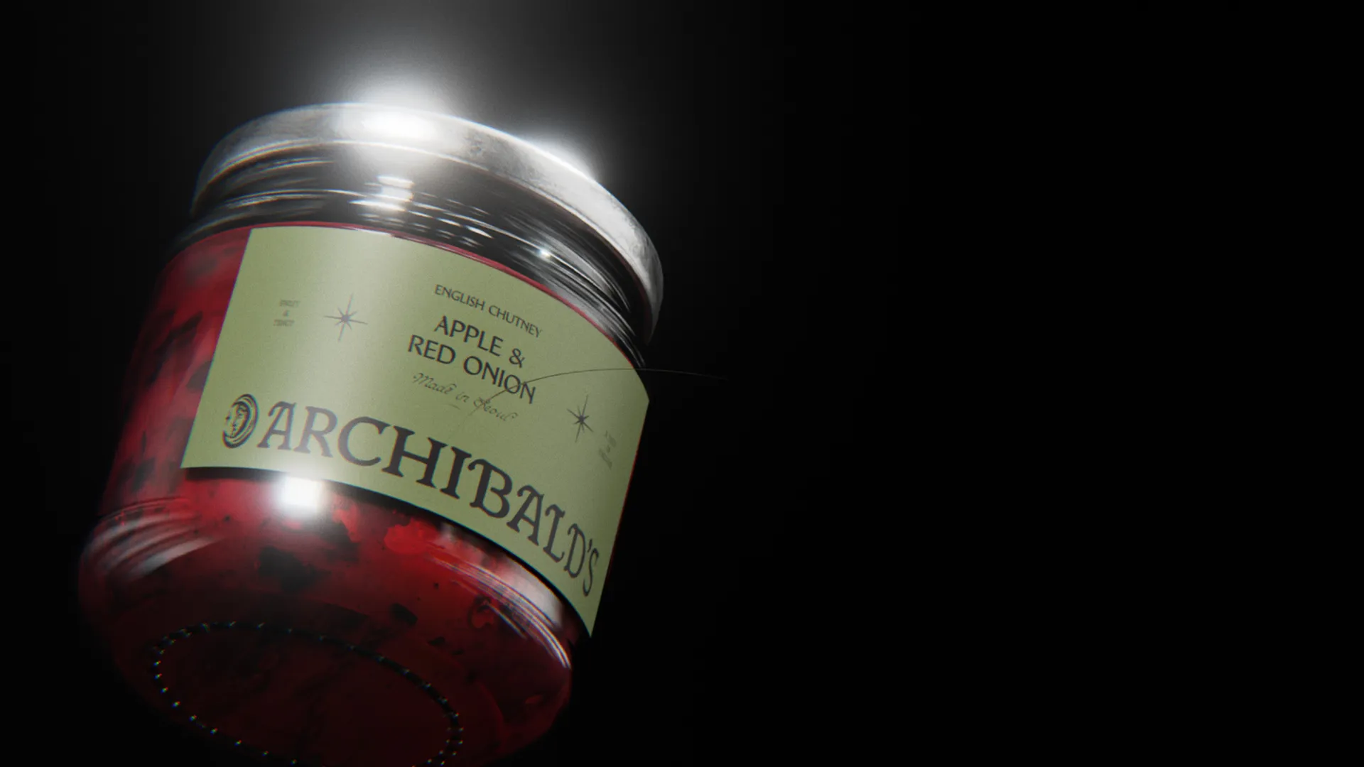
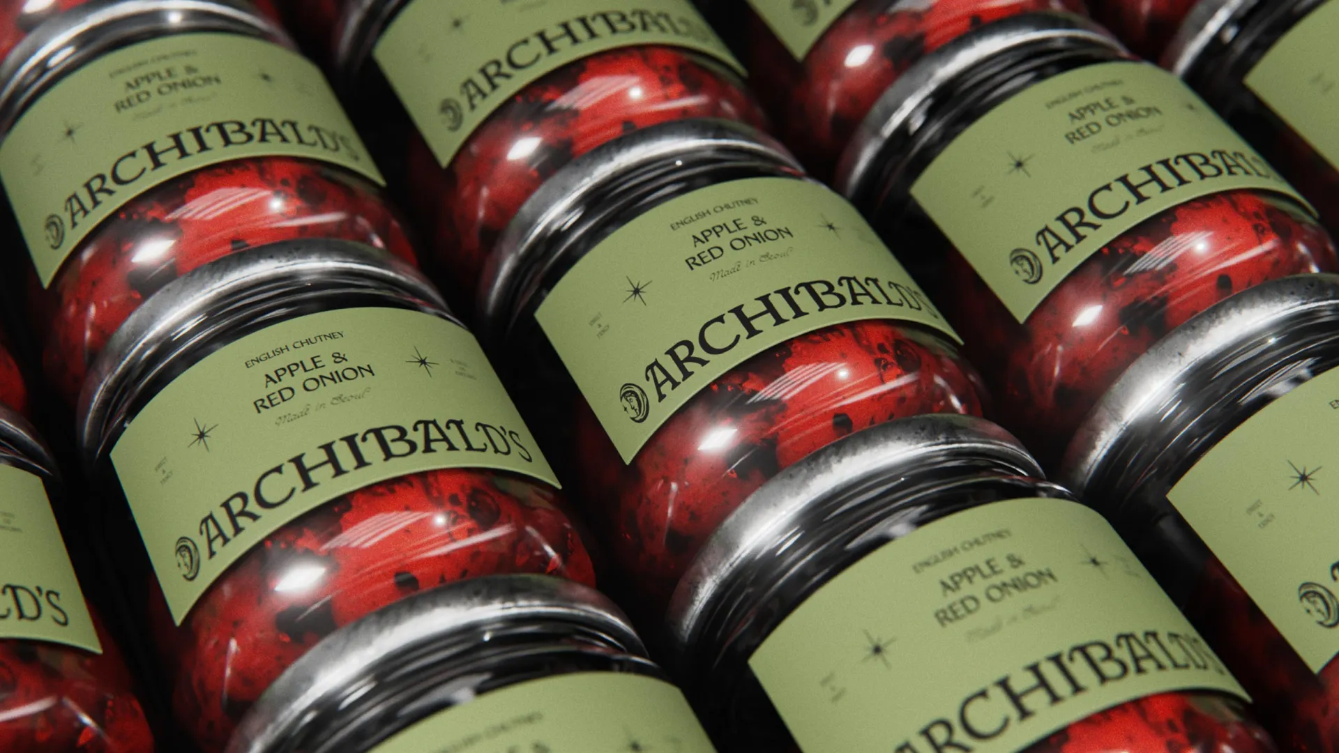
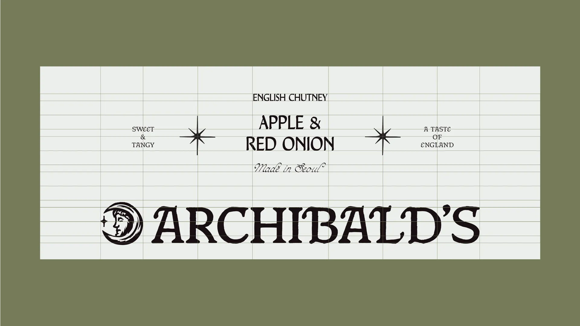
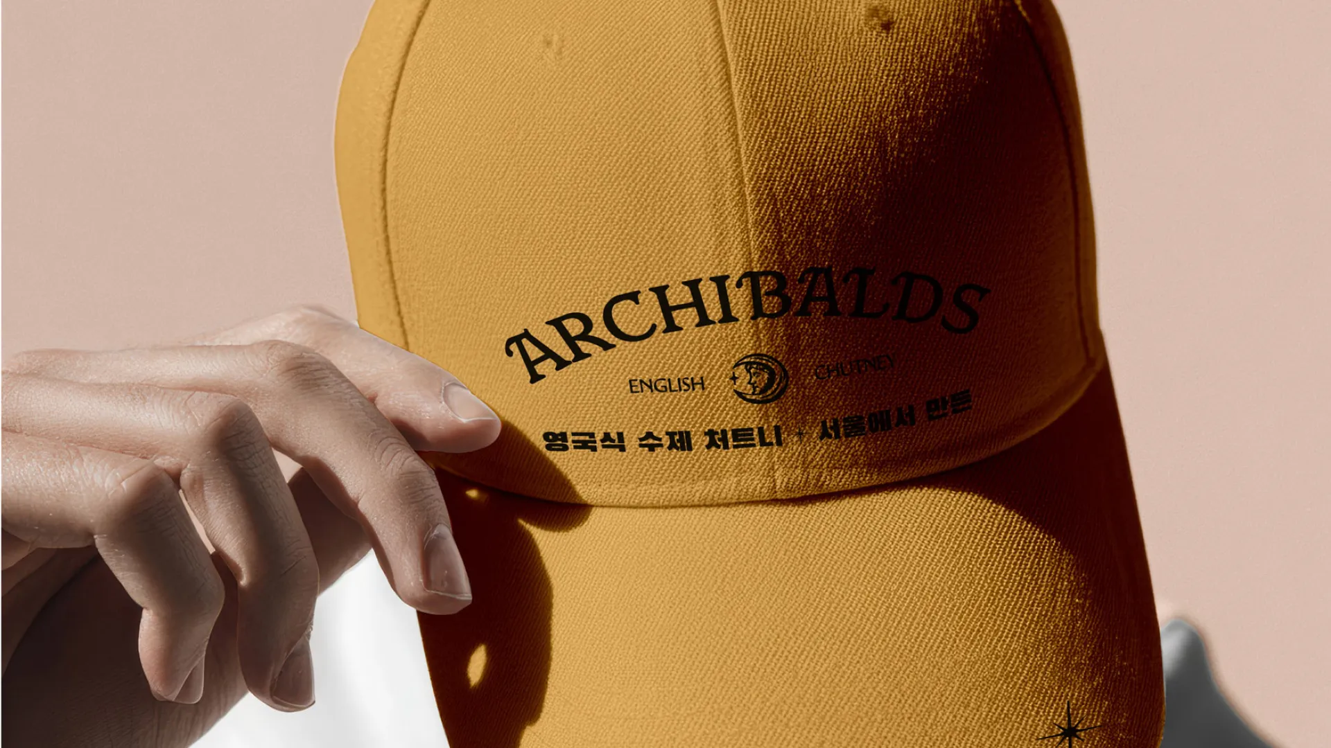
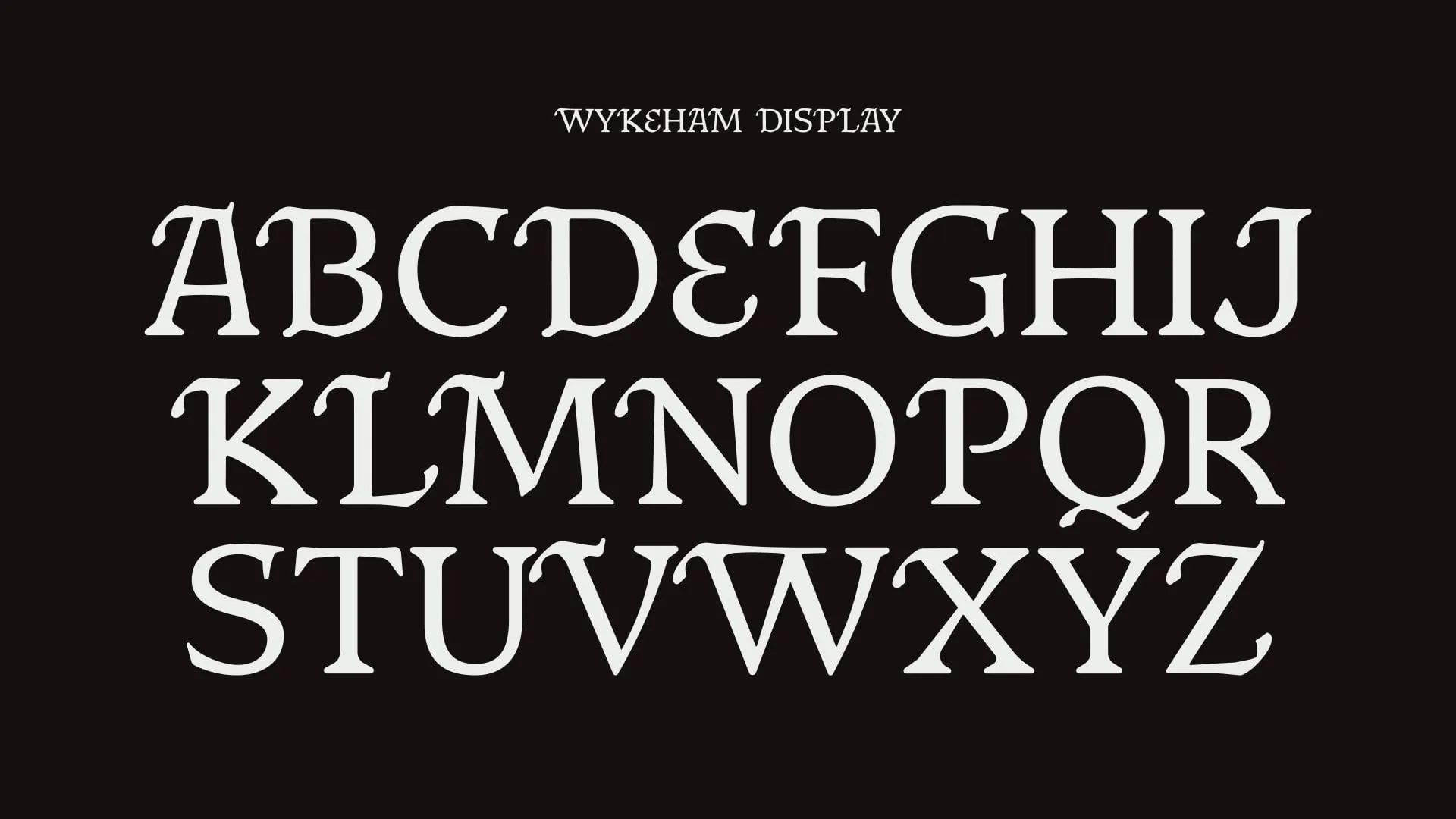
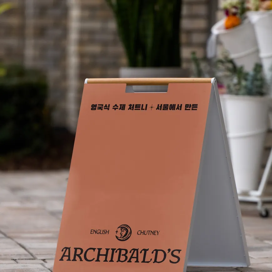
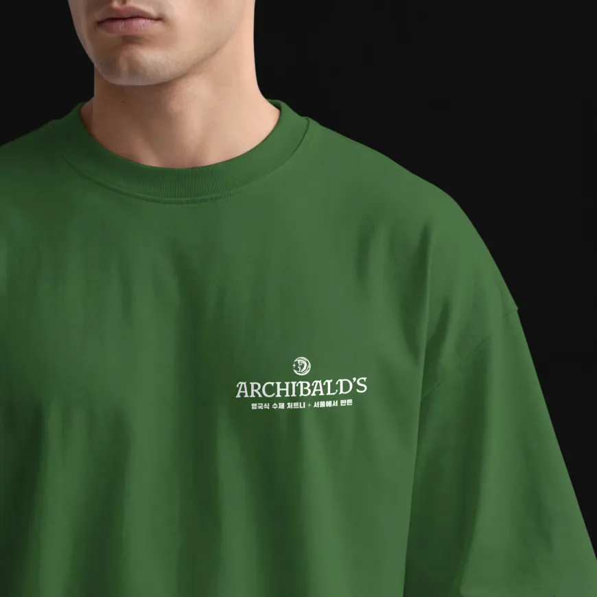
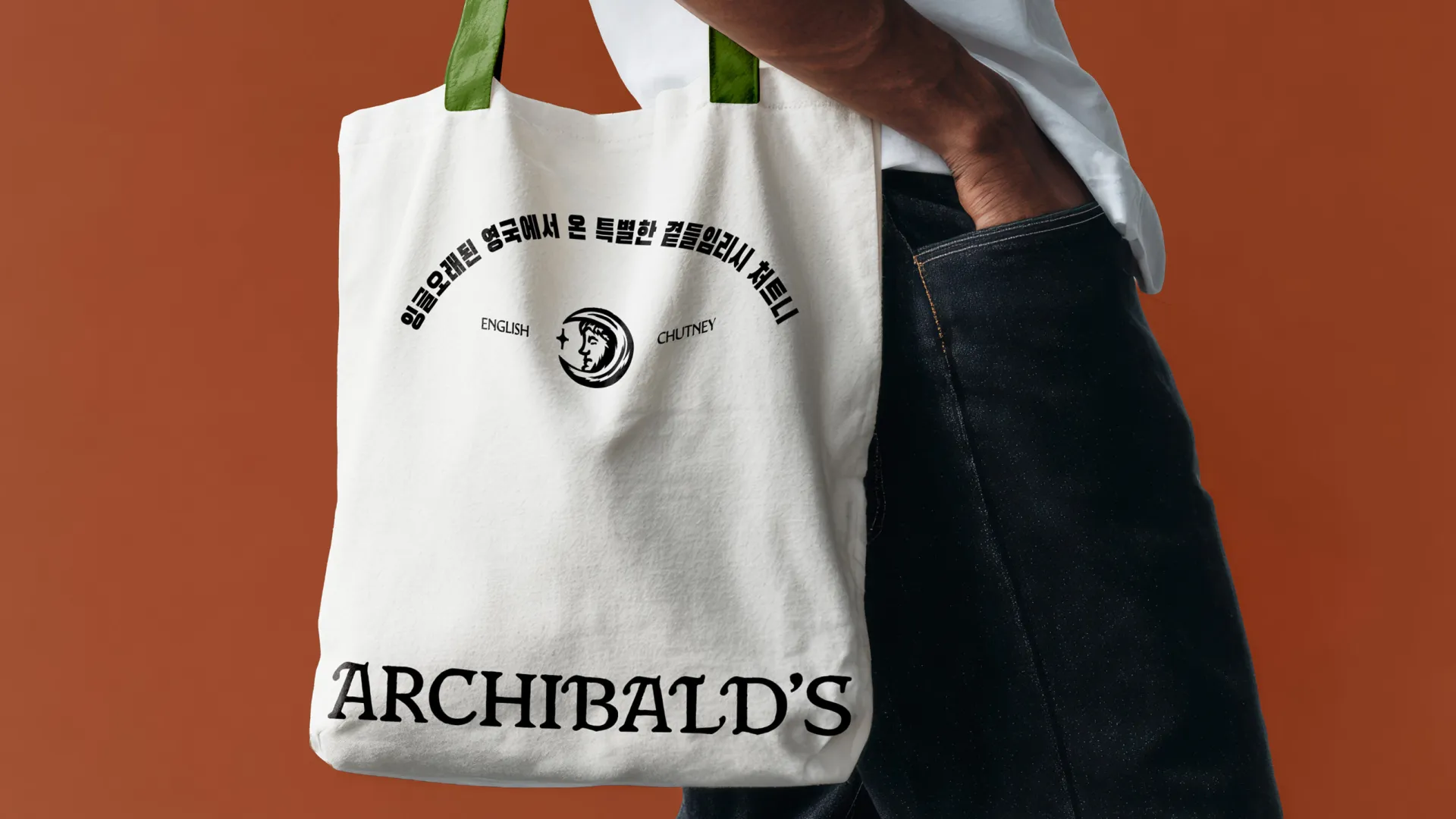
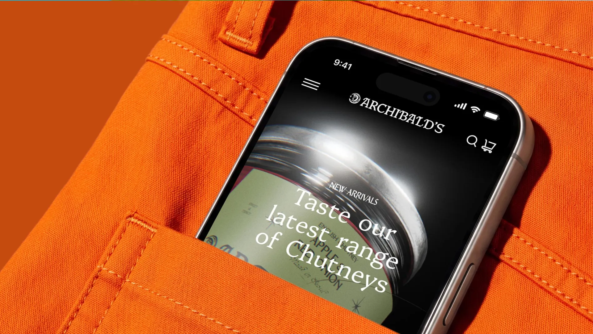
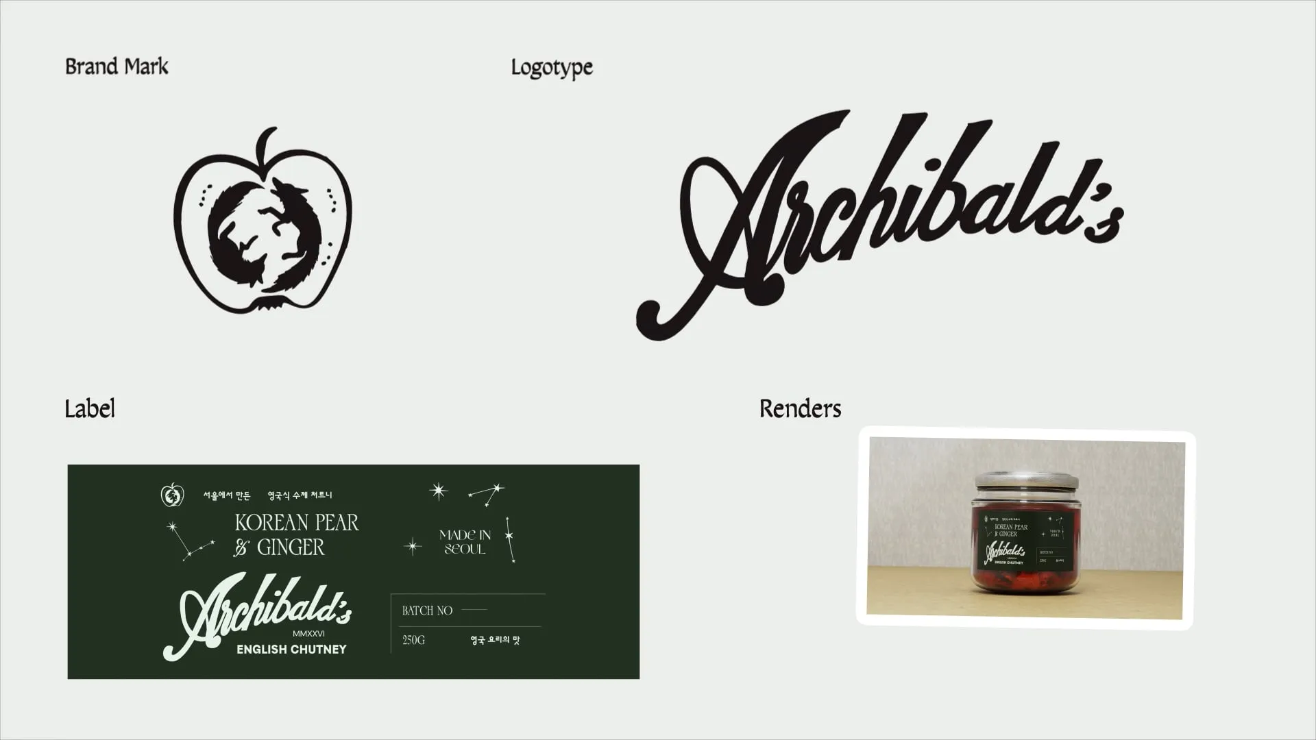
Visually, Archibald’s is designed to feel like it has been unearthed rather than launched. The custom Wykeham Display typeface gives the identity its own voice: carved, irregular and full of old-world character. The crescent moon mark brings in a quiet sense of myth, while the warm cream, forest green and spiced terracotta palette creates a world that feels earthy, handcrafted and premium. Across jars, labels, posters, apparel and digital , the brand balances restraint with personality, creating a launch-ready identity for an emerging chutney brand with one foot in English tradition and the other firmly on Korean tables.