Luma
Planning for a brighter future

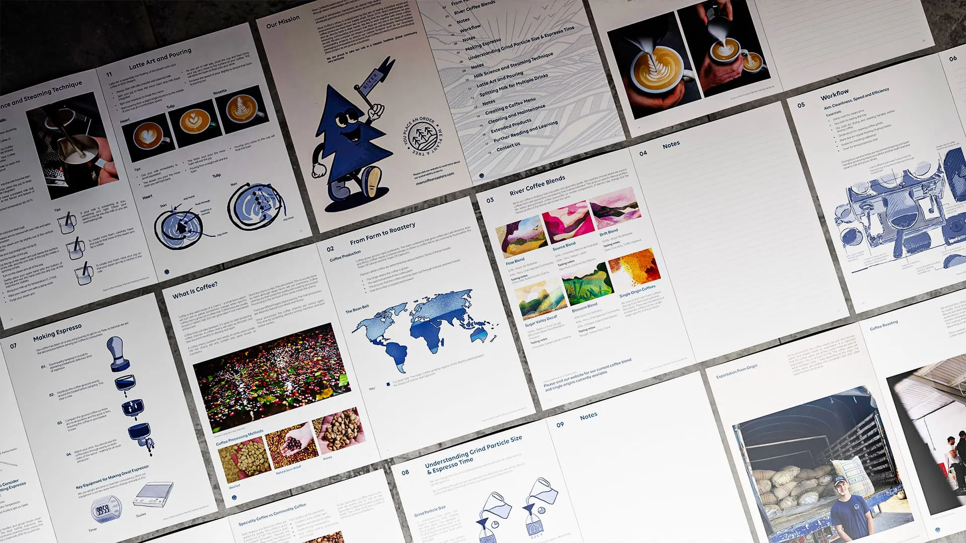
Coffee does not begin at the counter. It passes through landscapes, hands, climates, conversations, roasting profiles, delivery routes, cafés and morning rituals before it ever reaches the cup. River Coffee understands that better than most. Based in the heart of Hampshire, River Coffee had spent five years growing from a local speciality coffee roaster into a business serving cafés, wholesale customers and coffee drinkers across the UK. As the company continued to grow, the brand needed to work harder across packaging, point of sale, marketing, e-commerce and wholesale.



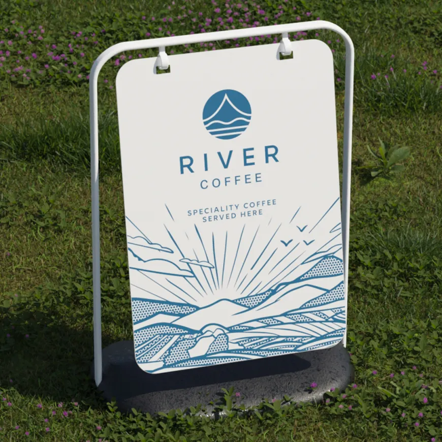
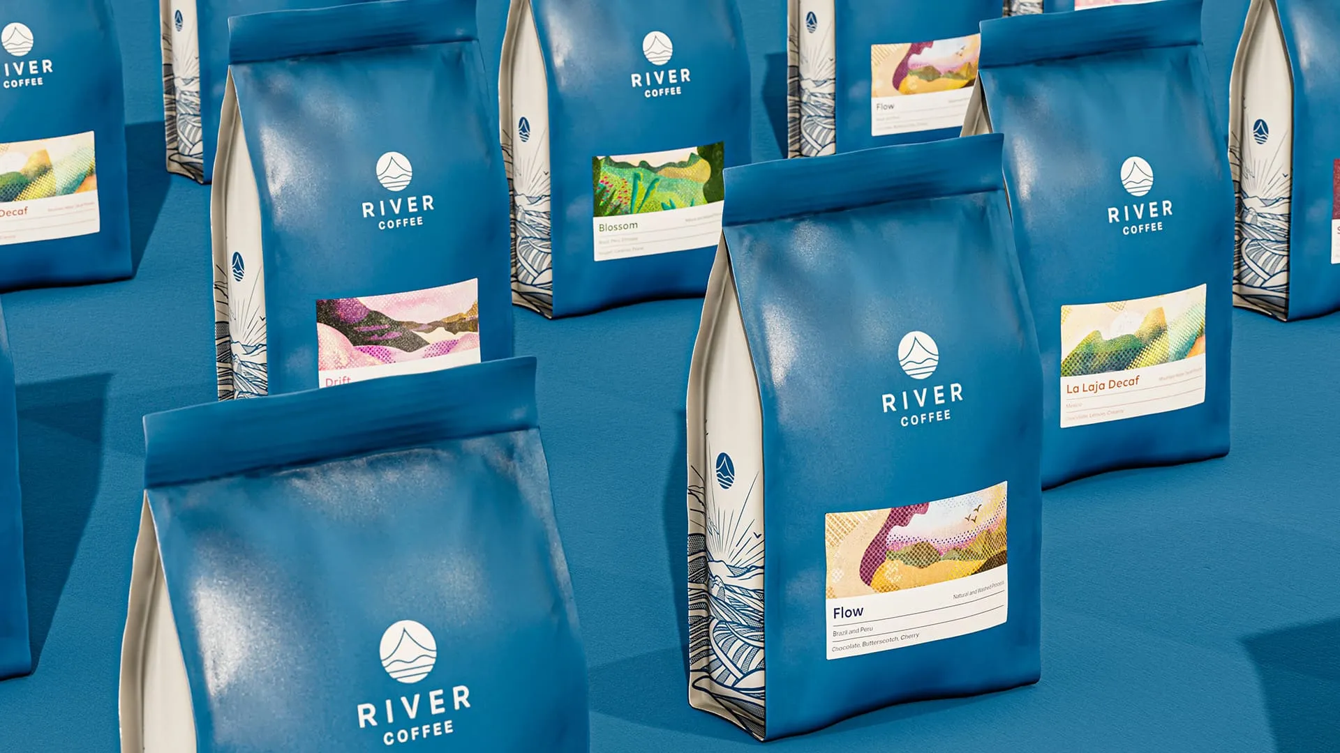
Think Creative worked with River Coffee to create a refreshed brand strategy and packaging identity built around the idea of 'A Collaborative Brew'. A celebration of the people, places and processes that turn coffee from crop into cup. The visual identity was stripped back to give the brand more confidence and clarity. We refined the logo, introduced a cleaner typographic system and created a packaging structure that felt direct, tactile and shelf-ready.
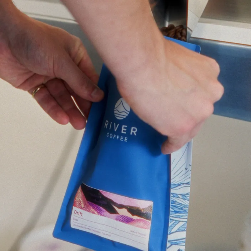
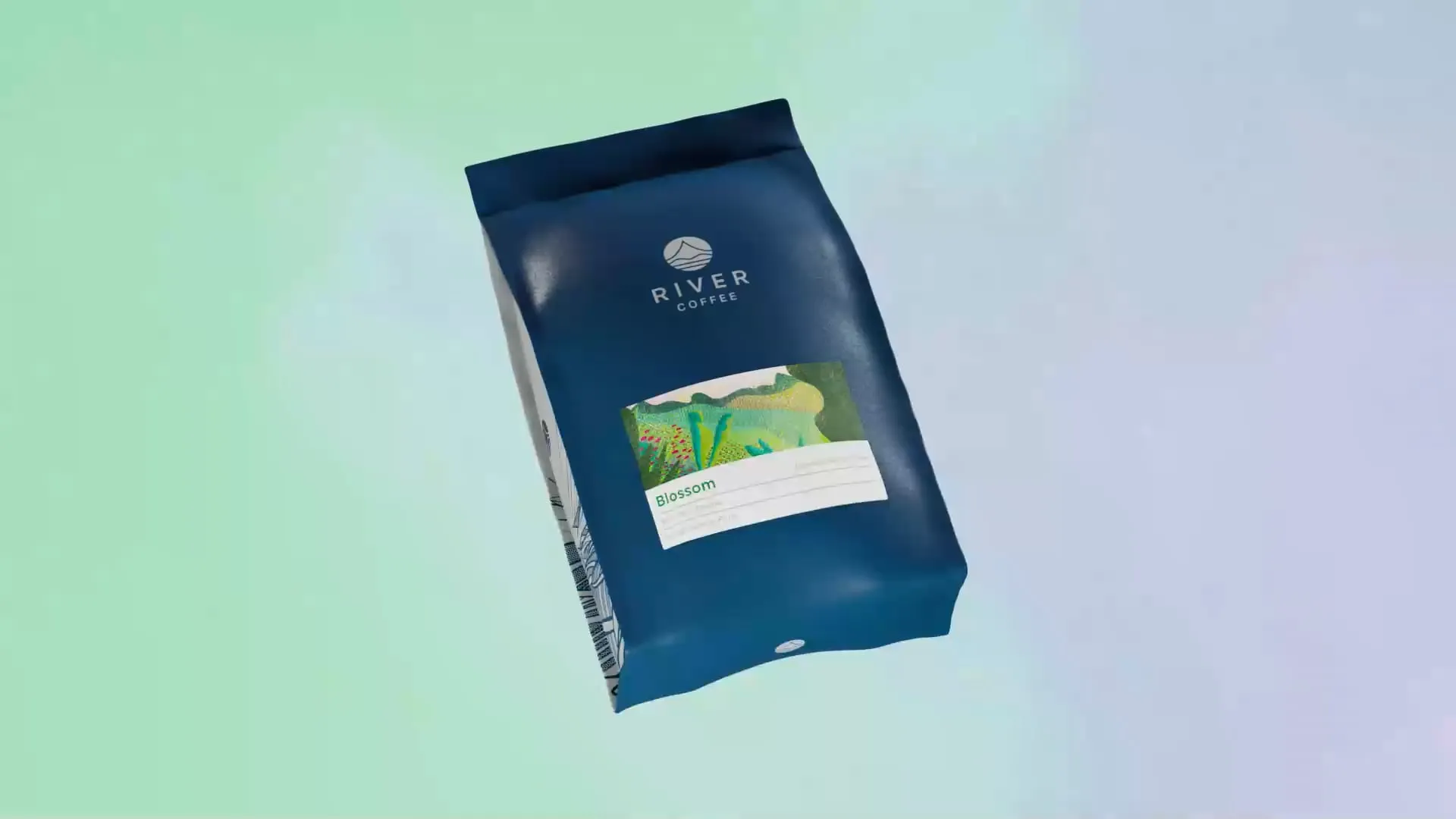
The expressive part of the identity lives in the labels. Each blend was given a unique artwork inspired by the origin of the beans, the landscape they came from and the tasting notes in the final cup. This gave every coffee its own personality, while helping customers navigate the range more easily across online retail and physical packaging. The system was then expanded across retail bags, wholesale bags and capsule boxes, creating consistency without making the range feel repetitive. The bold blue packaging gave River Coffee a recognisable base, while the illustrated labels brought warmth, flavour and variety to each product.

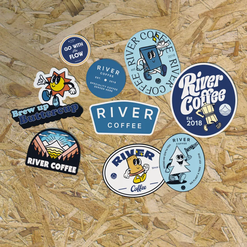
By simplifying the visual system, we also helped River move towards more sustainable printing and packaging options. A more efficient brand system, without losing the craft and character that made the business special. The result is a specialty coffee brand built around collaboration, origin and growth. Designed to stand out on shelf, sell online and support River Coffee’s next chapter.