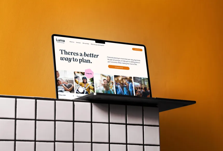
Luma
Planning for a brighter future
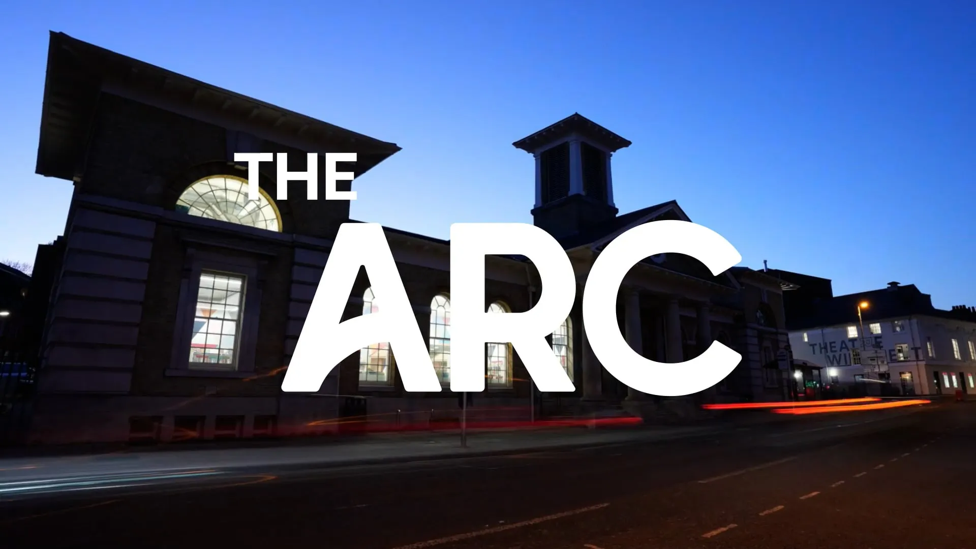
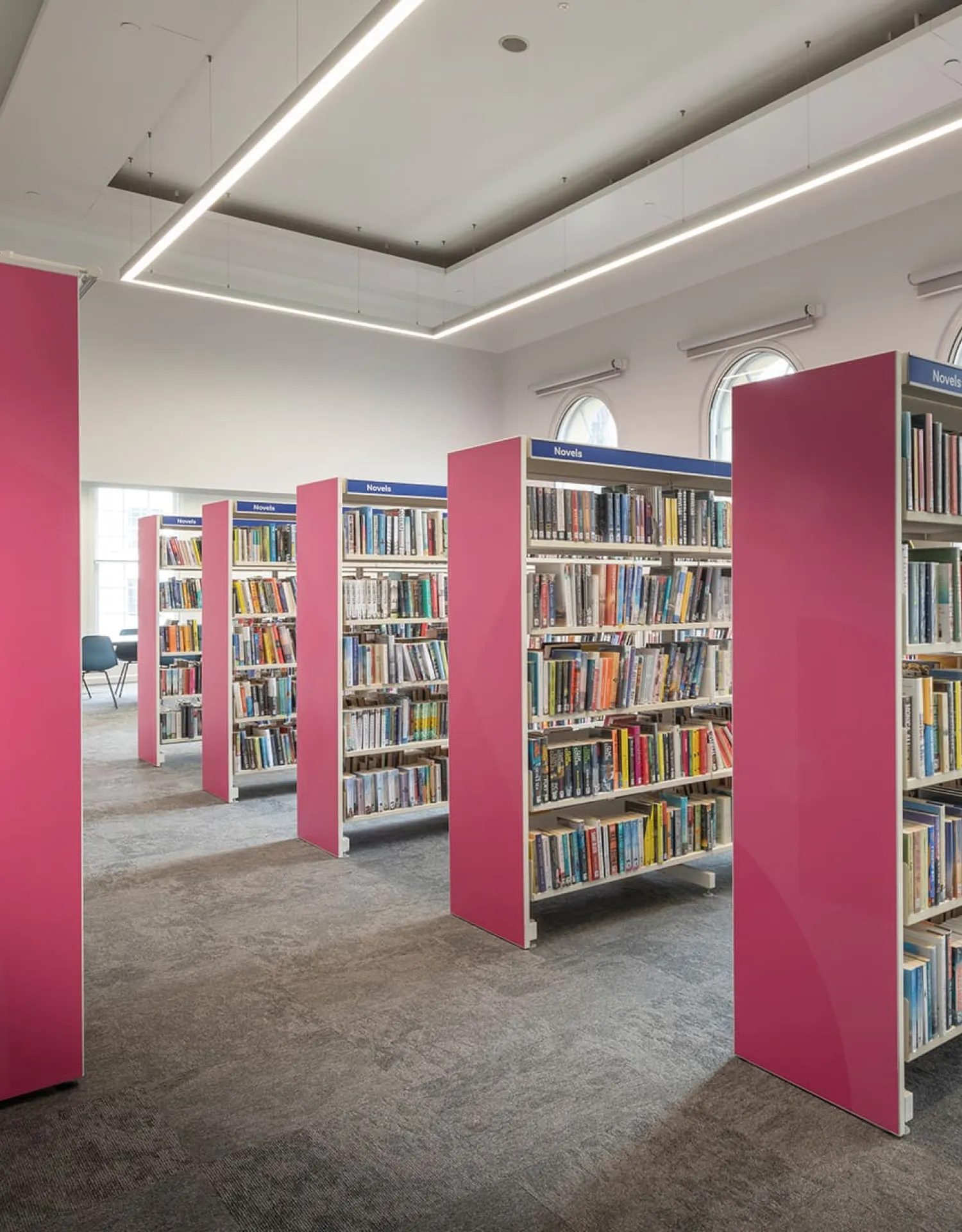
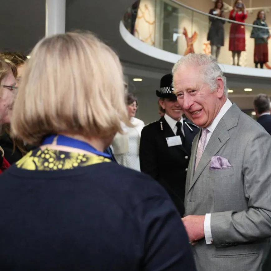
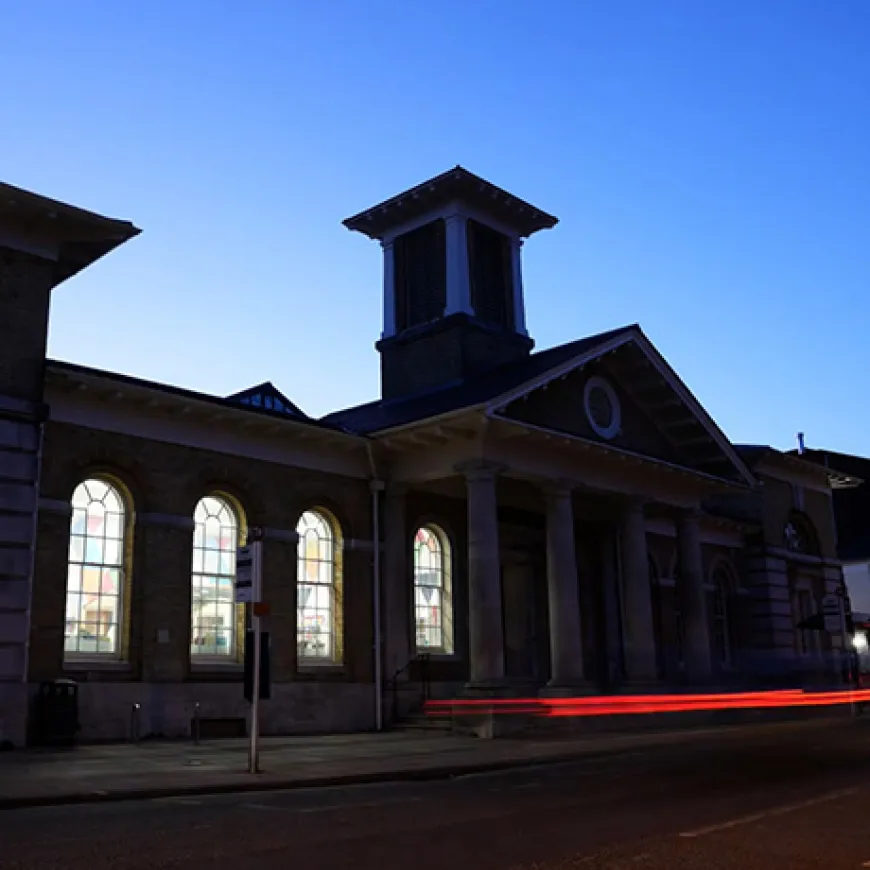
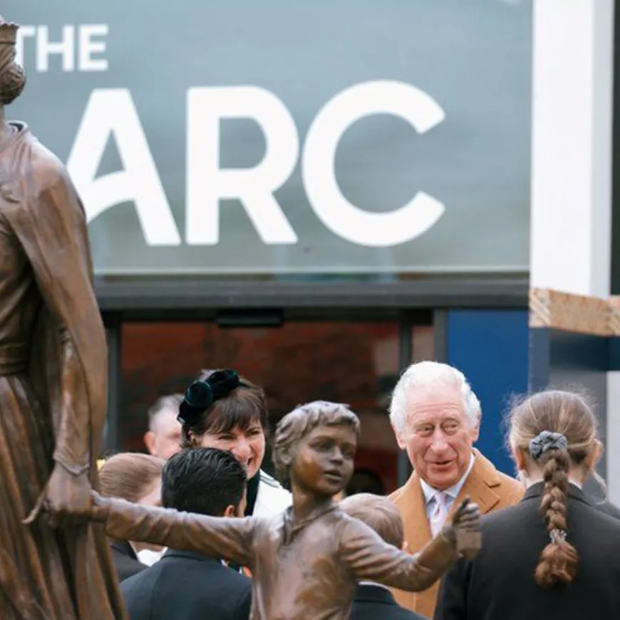
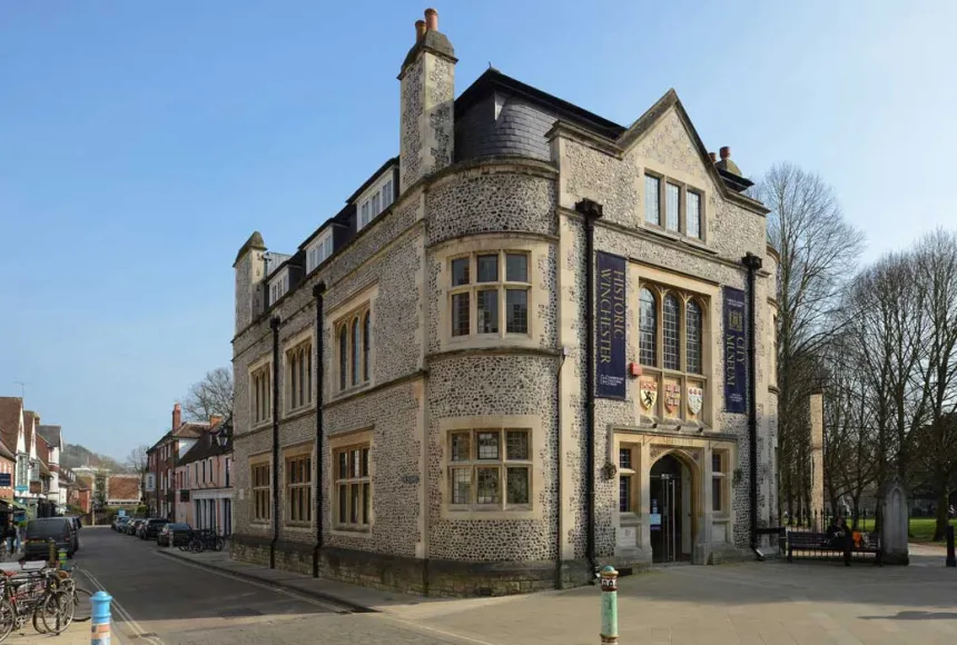
Culture plays a vital role in shaping the places we live. It reflects who we are, brings communities together and influences how people experience and connect with their surroundings. Hampshire Cultural Trust faced the challenge of taking ownership of Winchester’s new cultural hub, housed within the 186-year-old Corn Exchange. More than a rebrand, this was an opportunity to define a new cultural destination for Hampshire, bringing arts, reading, learning and community together under one roof.
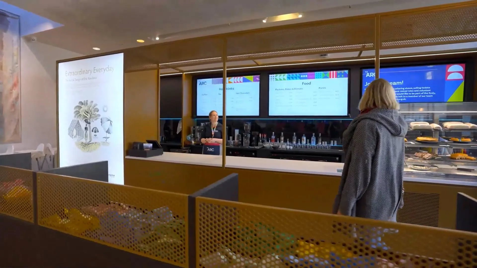
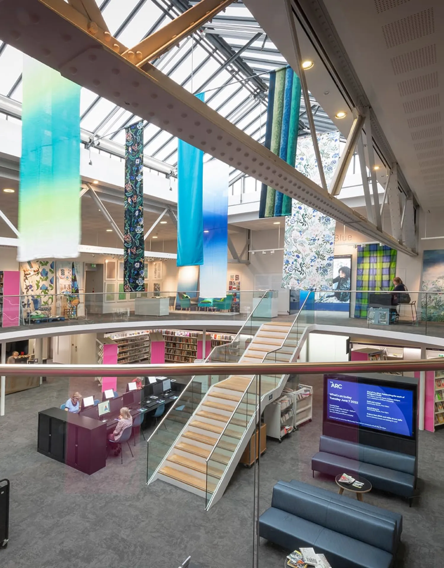
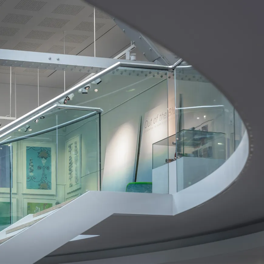
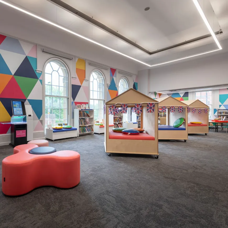
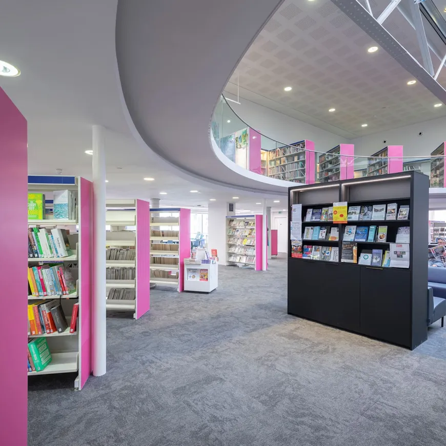
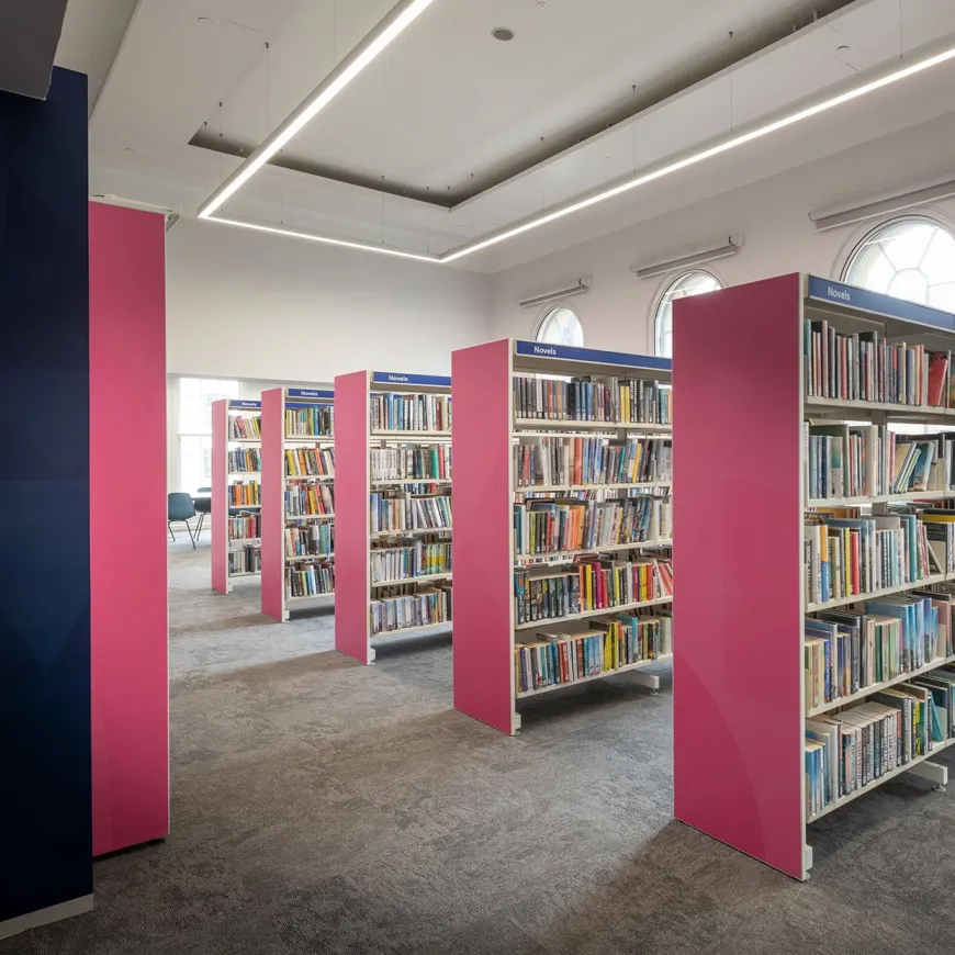
Think Creative was invited to create and express the vision for the building, developing a place brand that captured the partnership between Hampshire Cultural Trust, Hampshire County Council and Hampshire Libraries, while giving Winchester a welcoming, flexible and recognisable cultural space. We began by working closely with HCT, Hampshire County Council, library services staff, executive leadership and board members to define a shared vision. Through a focused strategy and brand development process, we translated the ambitions of each partnership group into a clear, accessible identity.
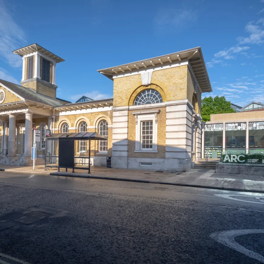
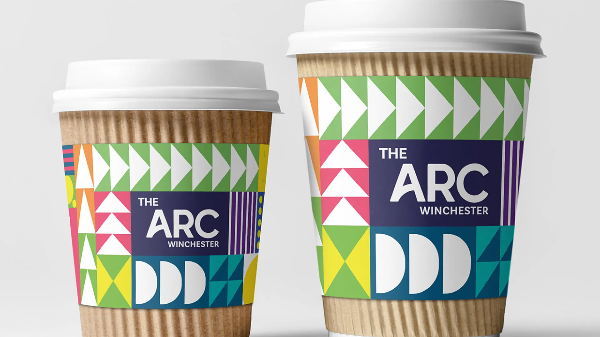
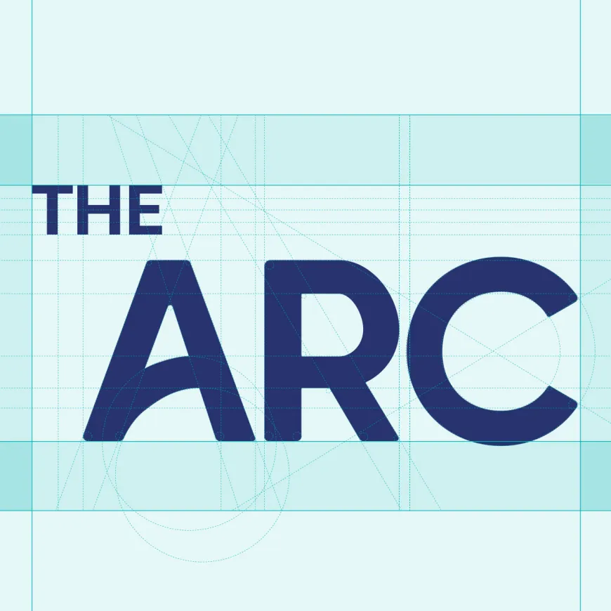
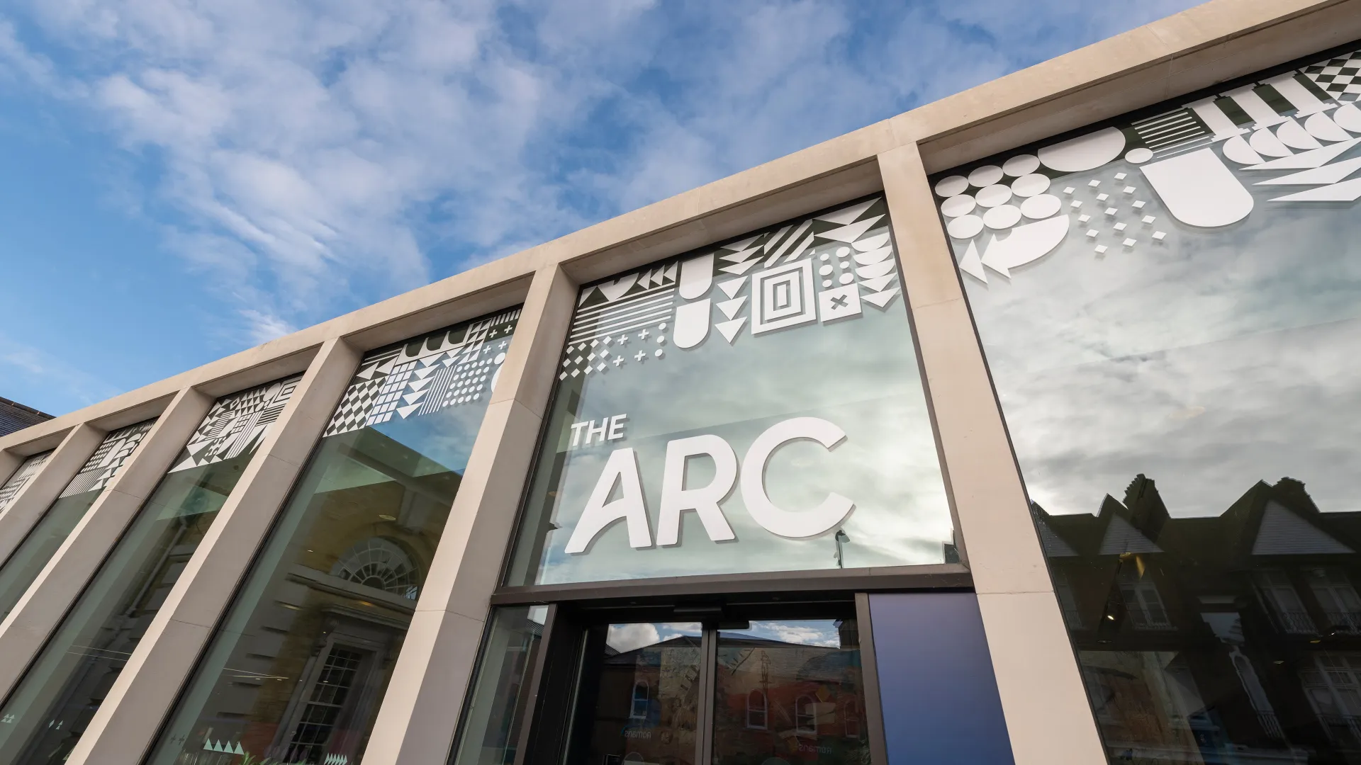
The name The Arc was coined and championed by the Think Creative team. It expresses the building’s core offer: Arts, Reading and Community. The idea was simple, memorable and open in meaning, the name gave the building a distinctive identity within Winchester’s cultural landscape.
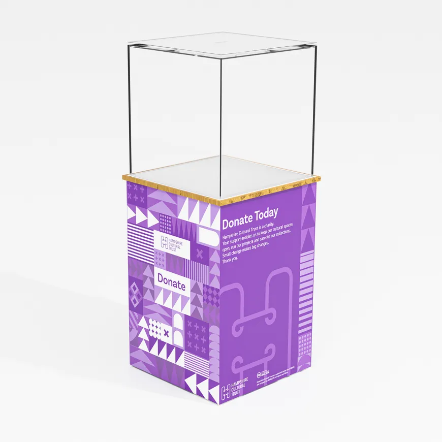
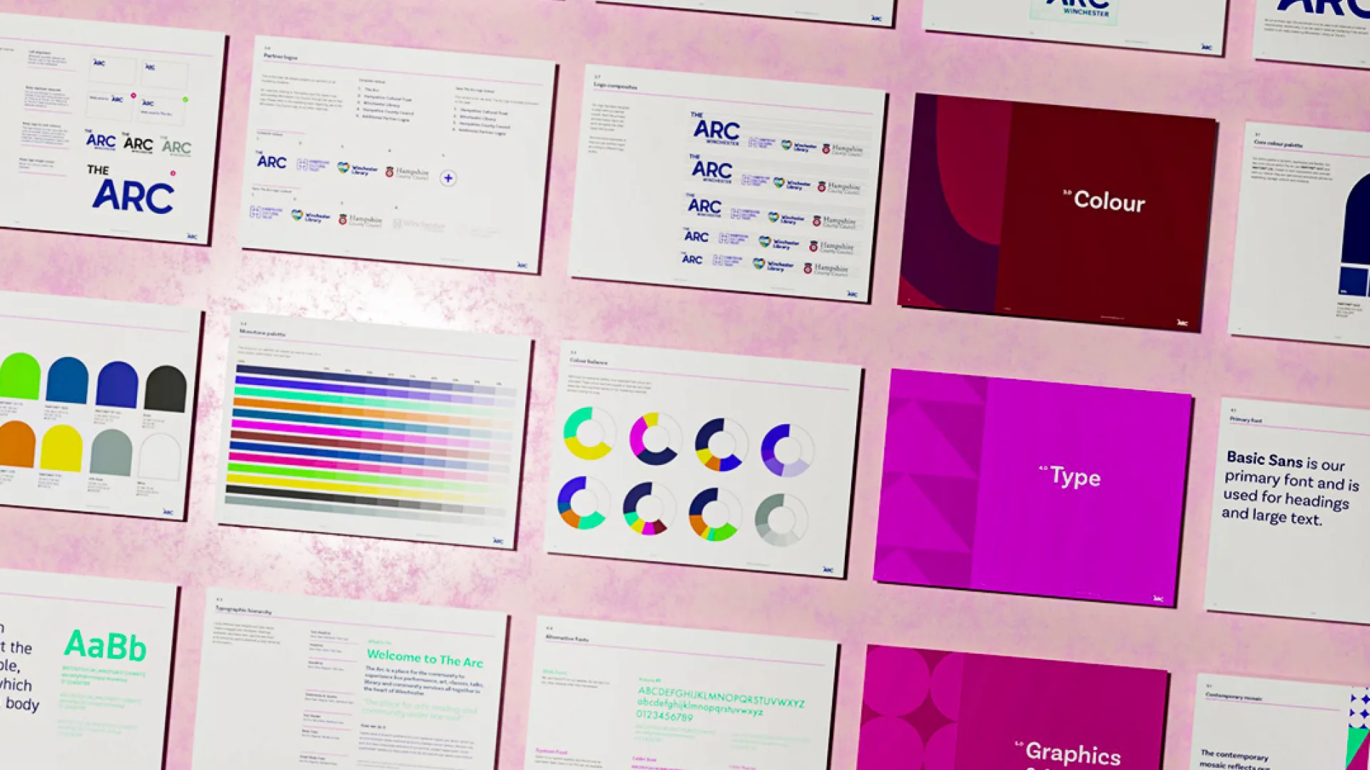
This foundation was brought to life through The Contemporary Mosaic, a modular visual language made from simple geometric forms inspired by the building’s architecture. The system symbolises how different people, interests and experiences can sit side by side within one shared cultural space. The colour palette draws from both Hampshire Cultural Trust and Hampshire Libraries, reinforcing the collaborative nature of the project while giving the brand a vibrant, contemporary feel. The result is an identity that feels civic, creative and accessible.
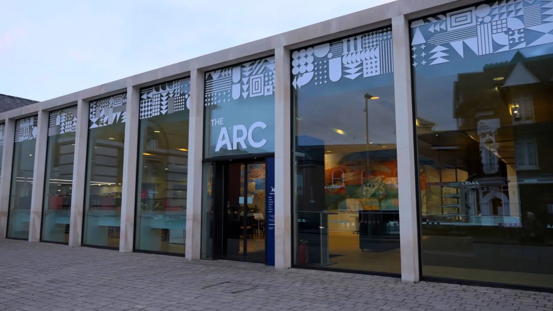
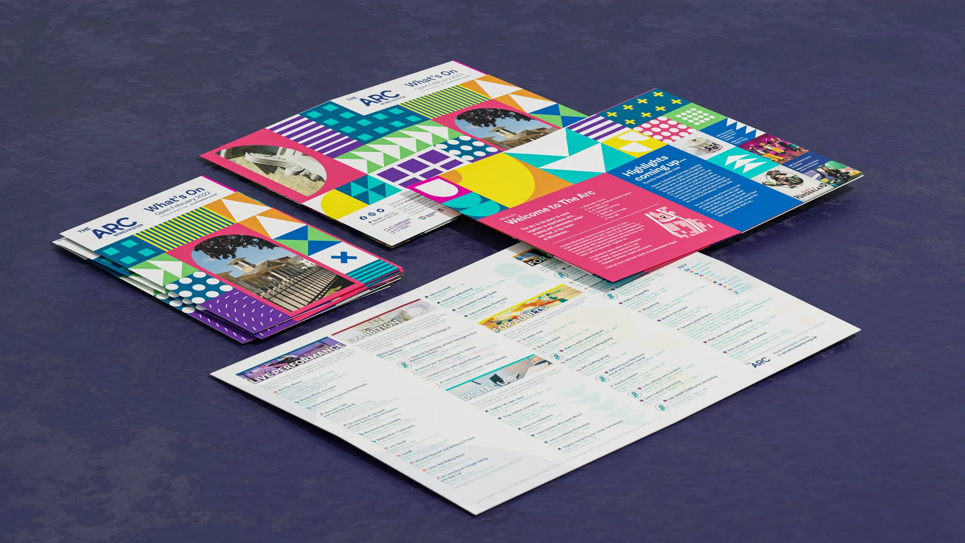
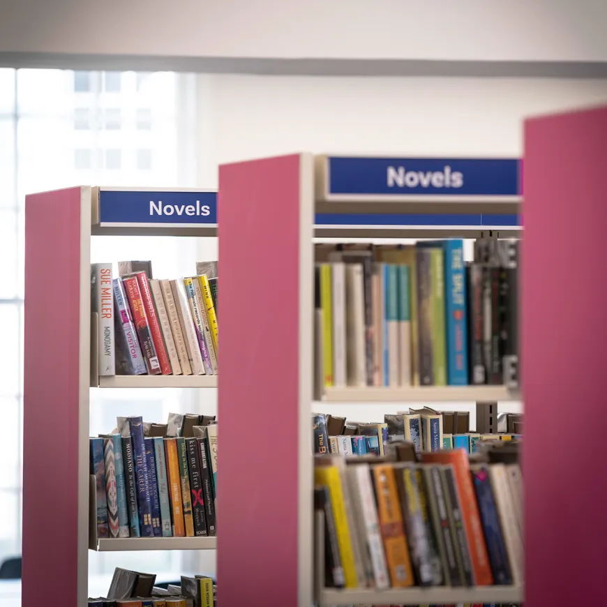
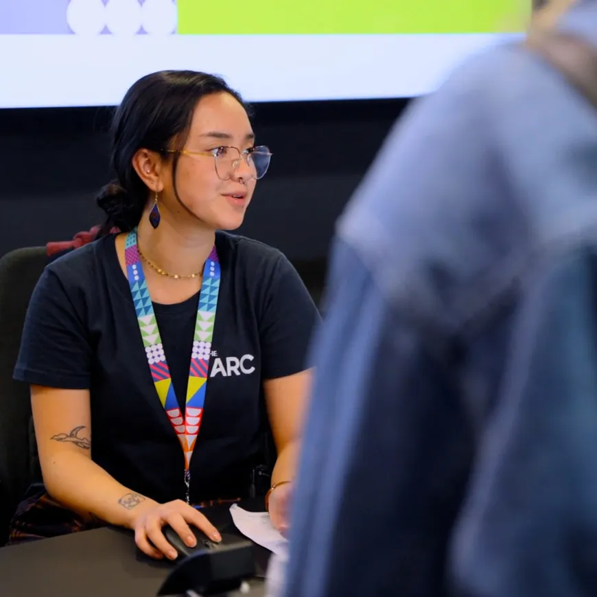
We created a complete visual identity system spanning signage, wayfinding, internal and external branding, packaging, animation, marketing materials and uniforms. A bespoke typeface was developed for the core brand and sub-brand logotypes, giving The Arc a unique visual character and helping it stand proudly in the centre of Winchester. Across every major touchpoint, the brand needed to work at every scale from architectural signage and digital screens to exhibition graphics and printed collateral. We documented the full system in extensive brand guidelines, ensuring it could be applied consistently, accessibly and confidently by internal teams and external partners.