Luma
Planning for a brighter future
During lockdown, food delivery became functional. Boxes arrived. Meals were prepped. Essentials were dropped at the door. The Food Forager wanted to make delivery feel exciting again. Built around more than 300 locally sourced deli products, the business offered fresh fish, shellfish, handmade chocolates, store cupboard staples and curated hampers from independent suppliers. We created a brand identity and packaging system built around the thrill of receiving something worth opening.
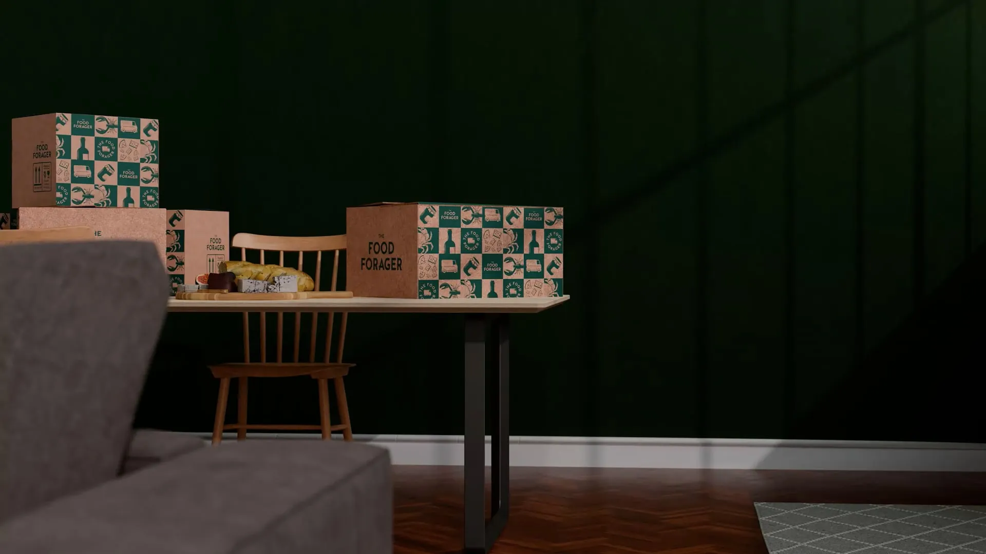
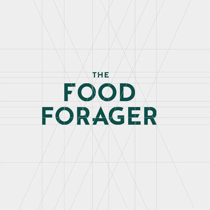
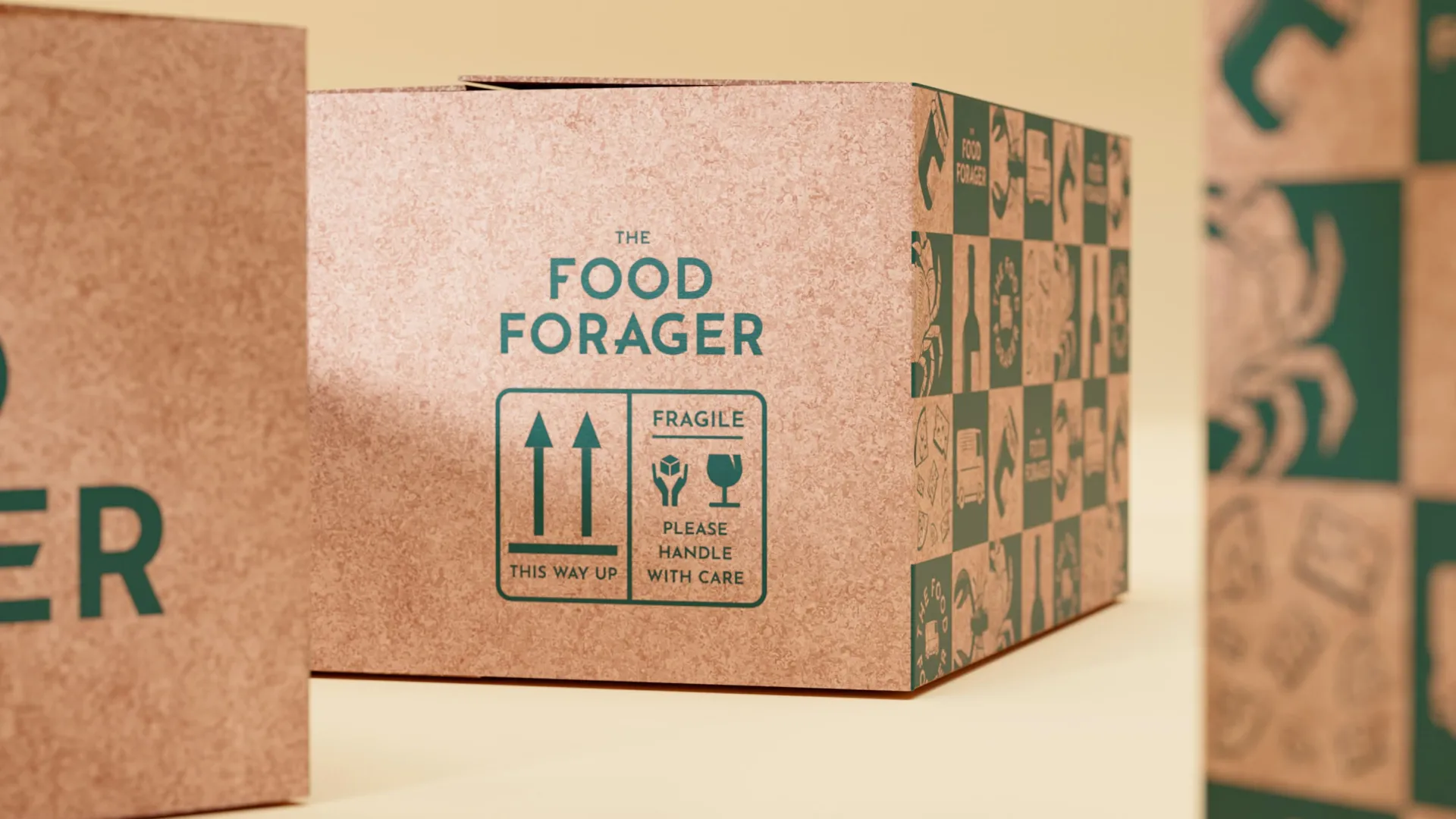
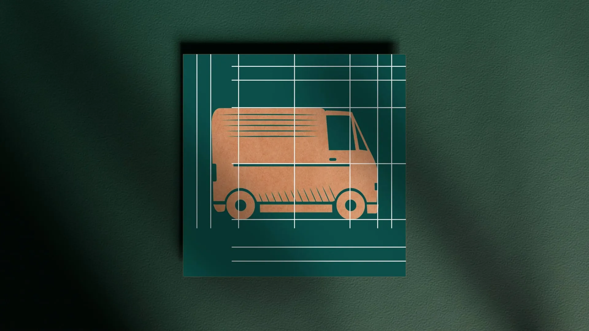
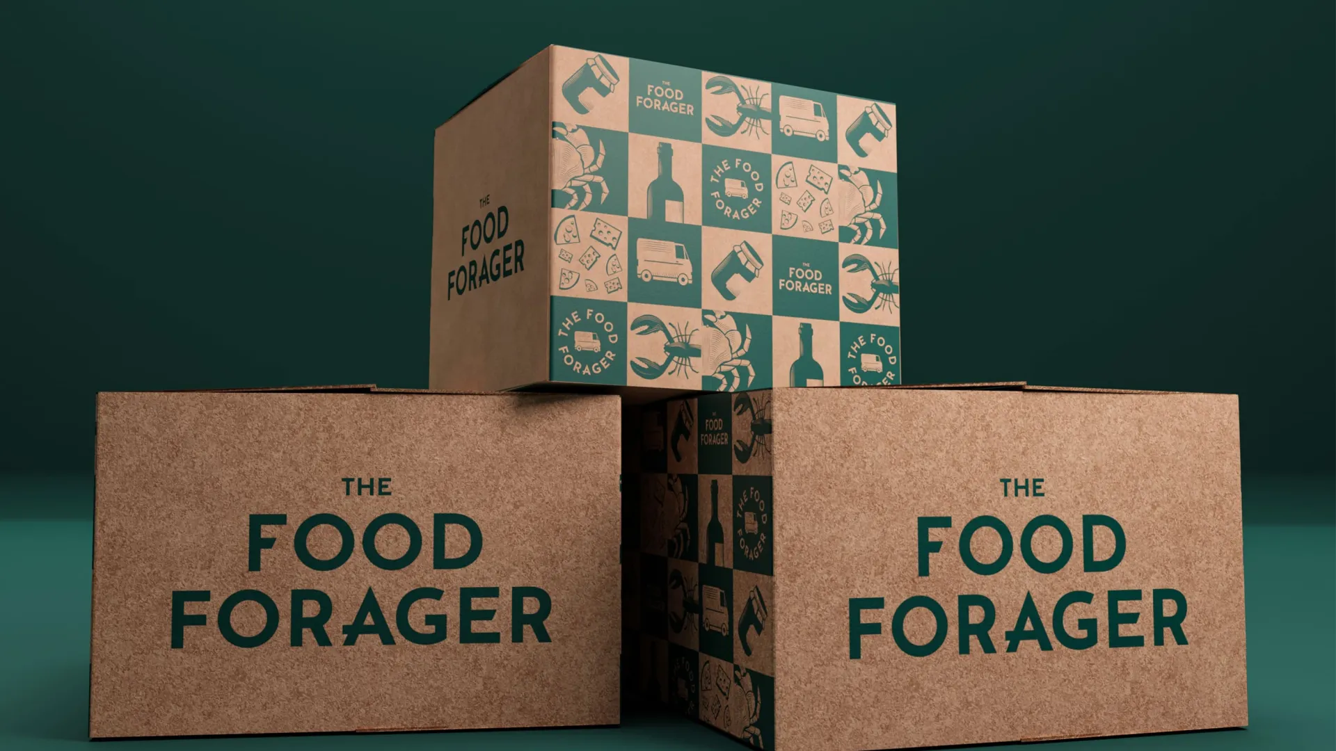
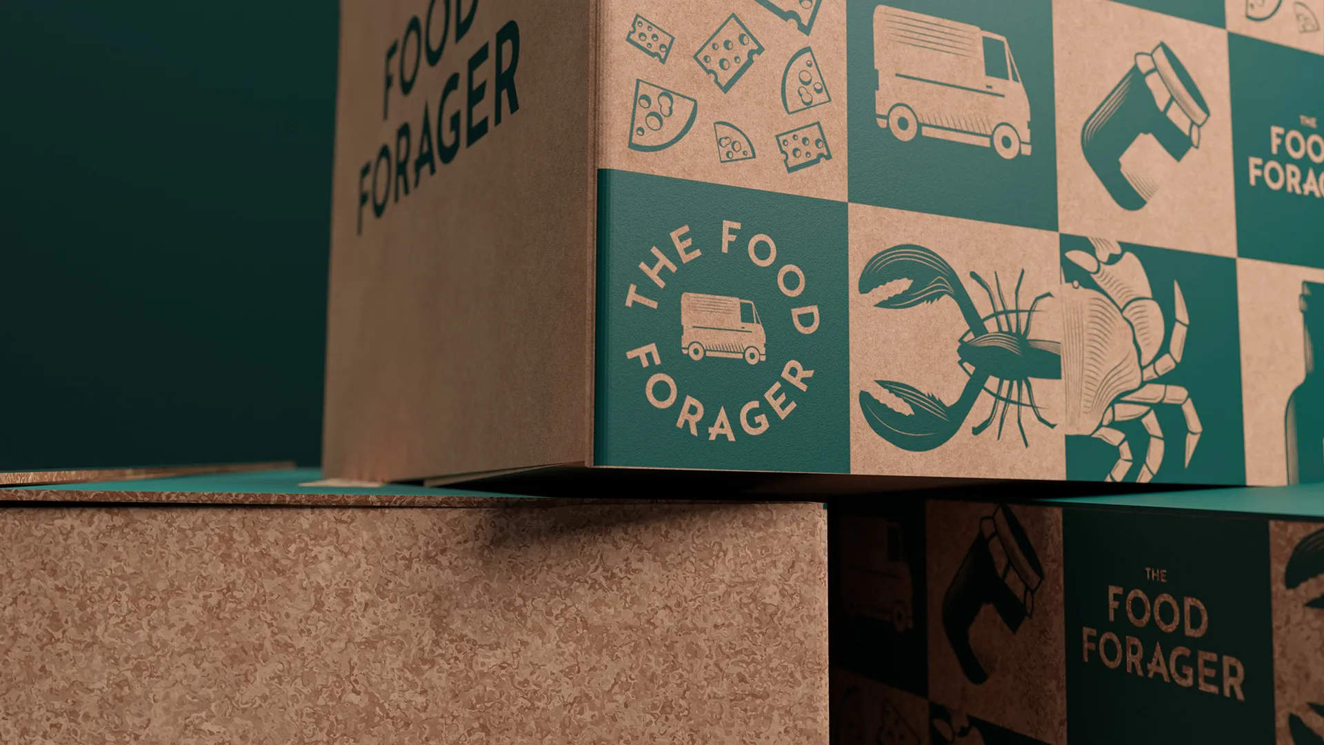
The visual language borrows from vintage postage stamps, first-class freight markings and delivery ephemera. A nod to movement, parcels and produce travelling from maker to doorstep. But rather than leaning into nostalgia too heavily, the system was sharpened with bold typography, clean geometry and a confident single-colour print approach. The logotype was designed to work hard on the box. Simple, strong and visible at distance, with small characterful details in the letterforms to make the brand feel warmer and more ownable. A secondary stamp logo, built around a delivery van icon, gave the system more flexibility across packaging, uniforms and smaller brand applications.
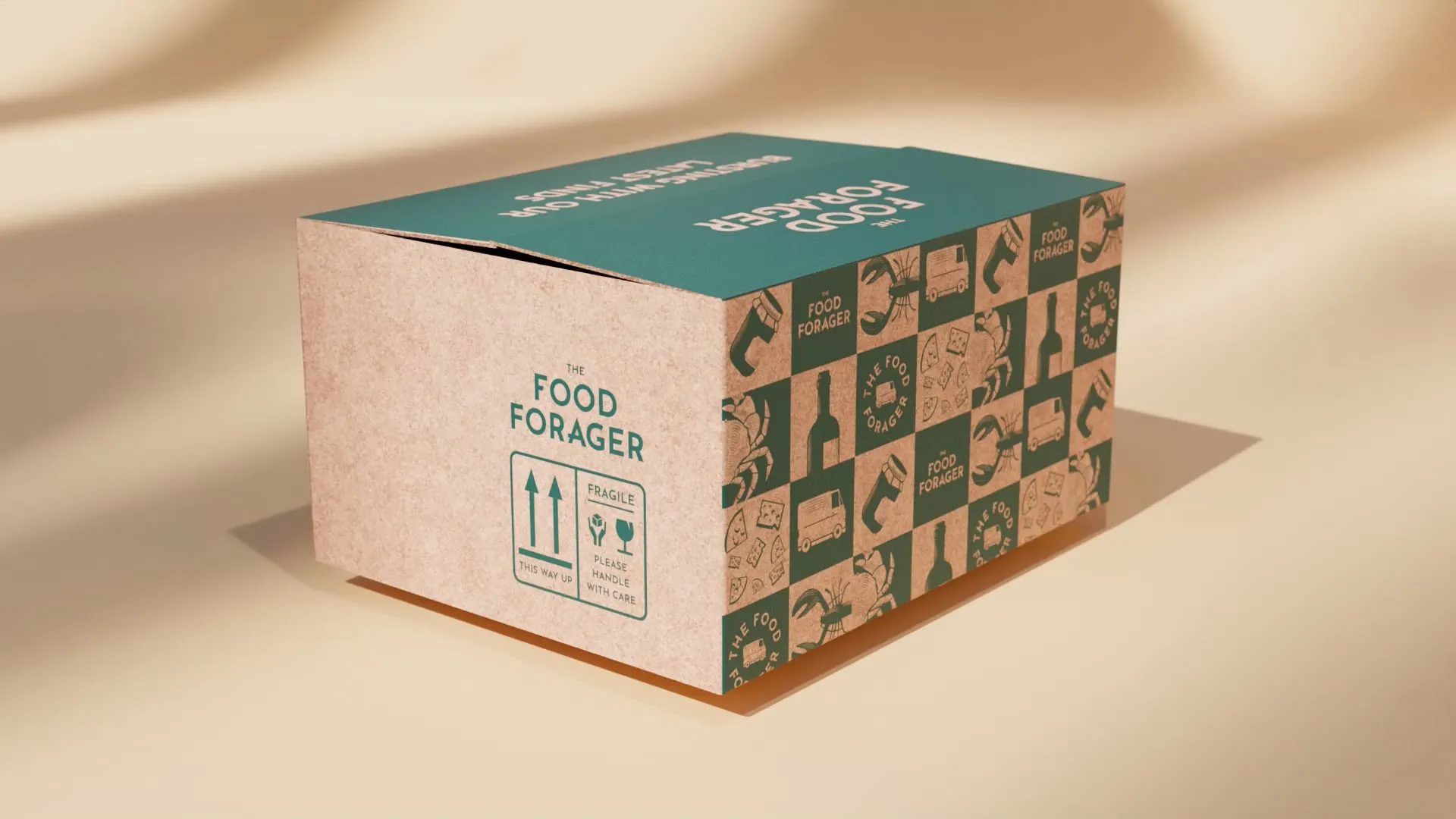

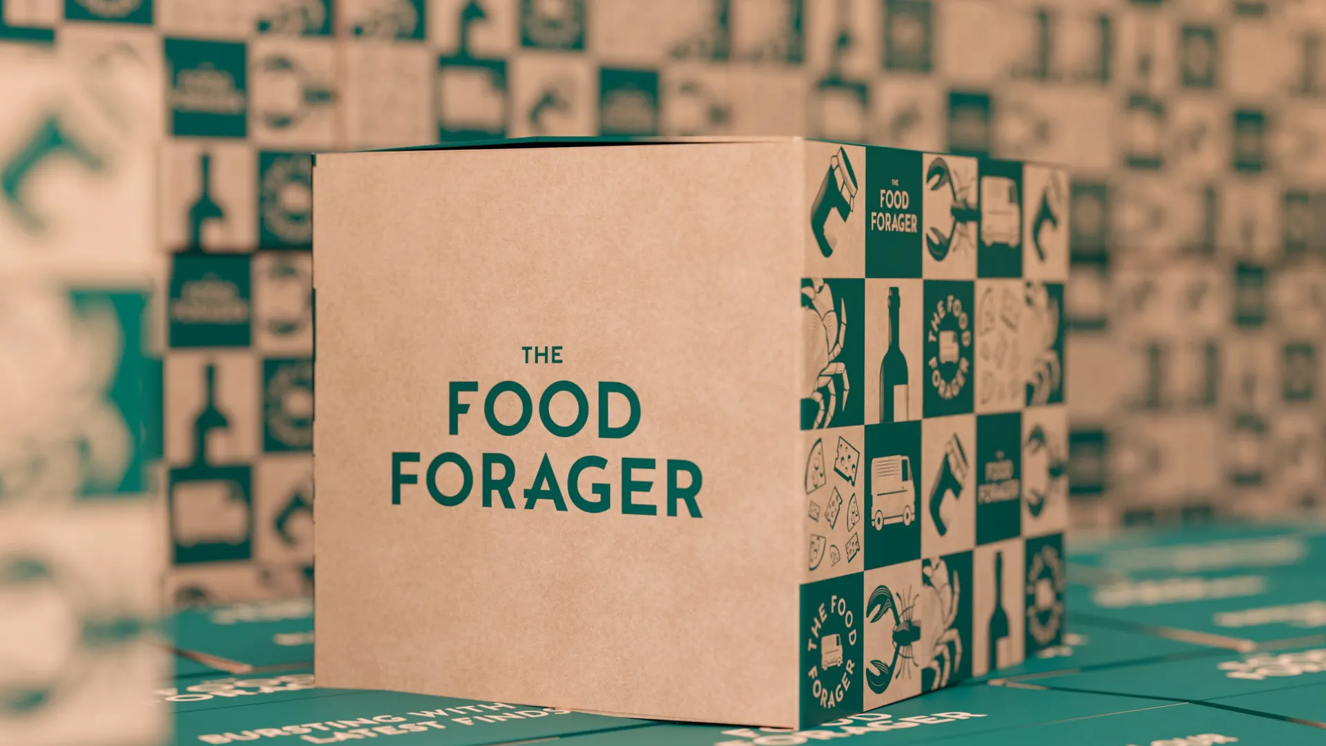
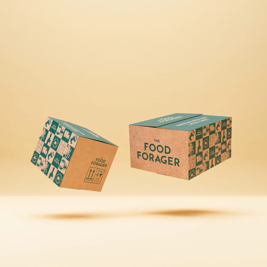
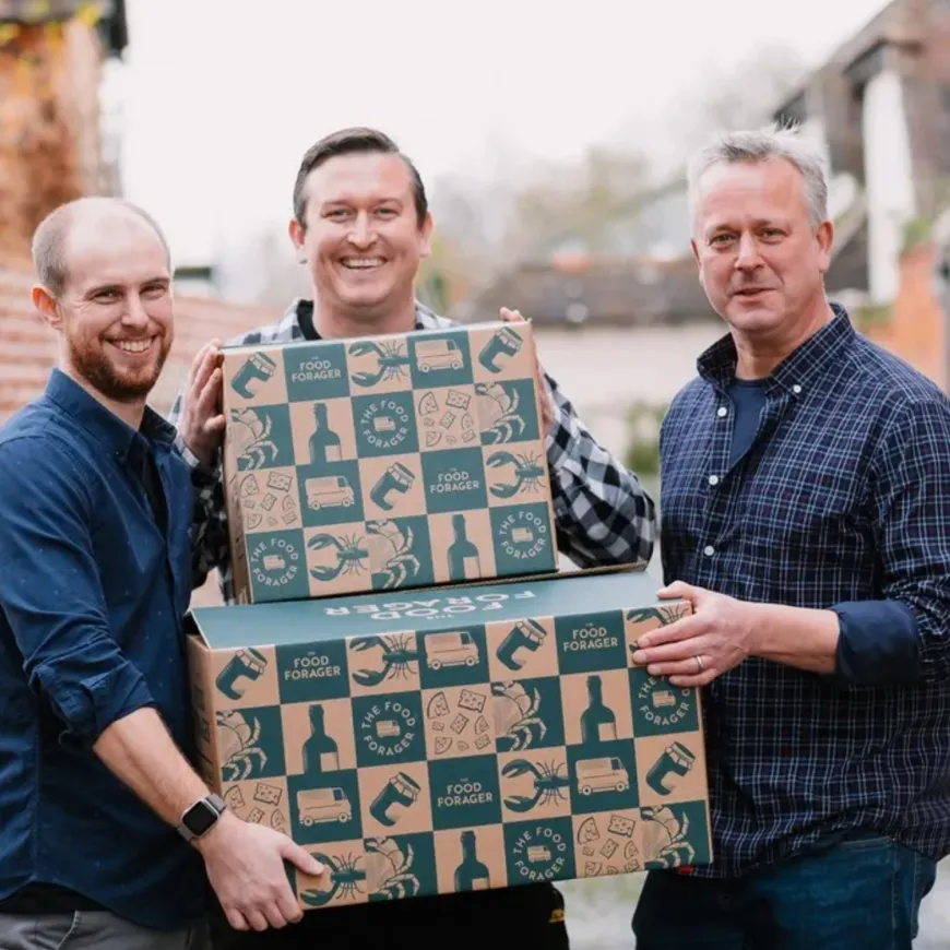
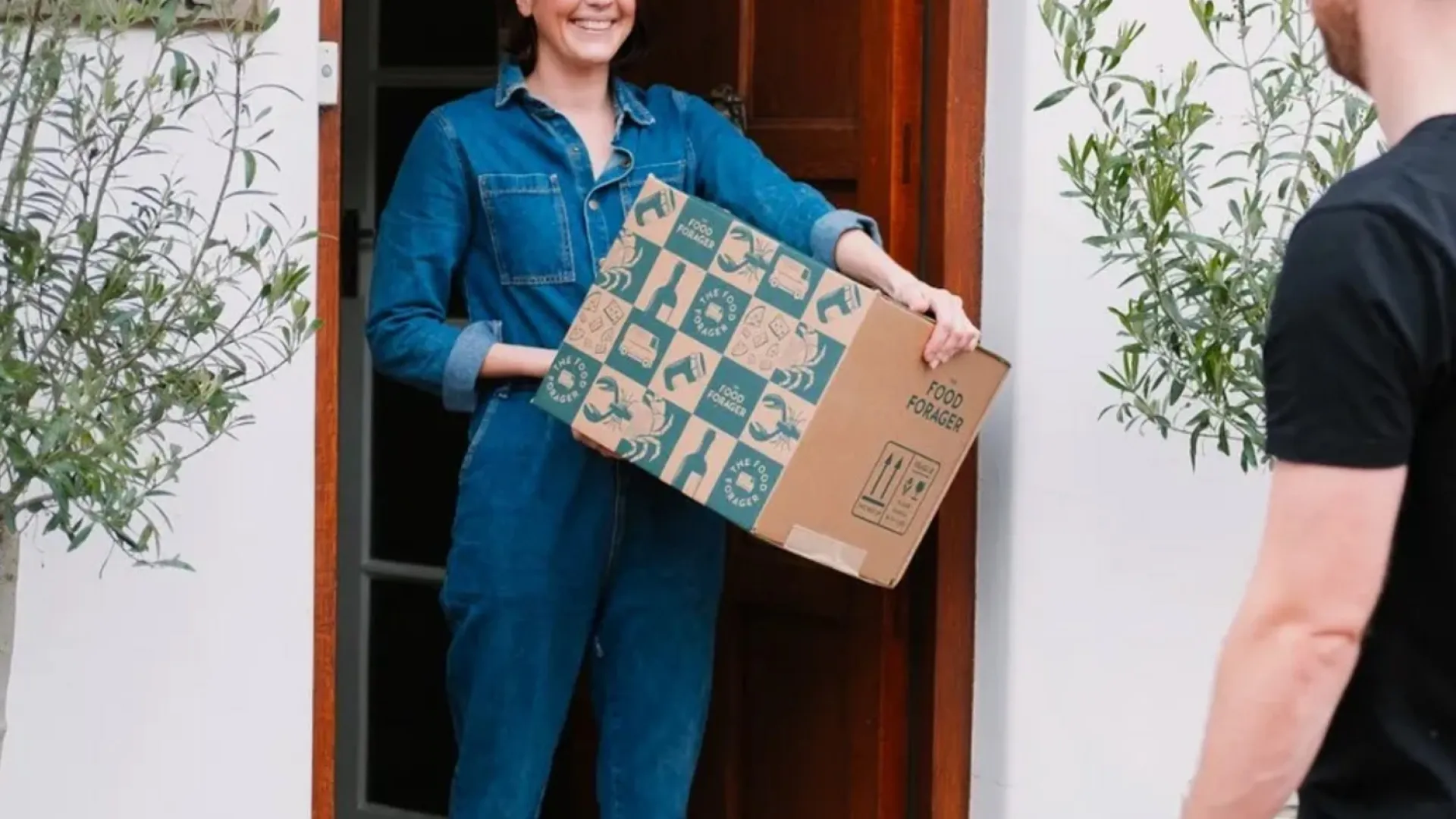
The box became the main brand experience. Using kraft cardboard and a single-colour green print, we created a packaging system that felt sustainable, cost-effective and distinctive. The illustration system brings the contents to life before the box is even opened. Food, bottles, seafood, vans and delivery symbols are arranged into a modular pattern that feels generous, practical and full of discovery. Each illustration was built on a consistent grid, giving the identity a sense of rhythm and structure while keeping the overall style playful.